Team Behind the Design
Agency: 1UP Brand
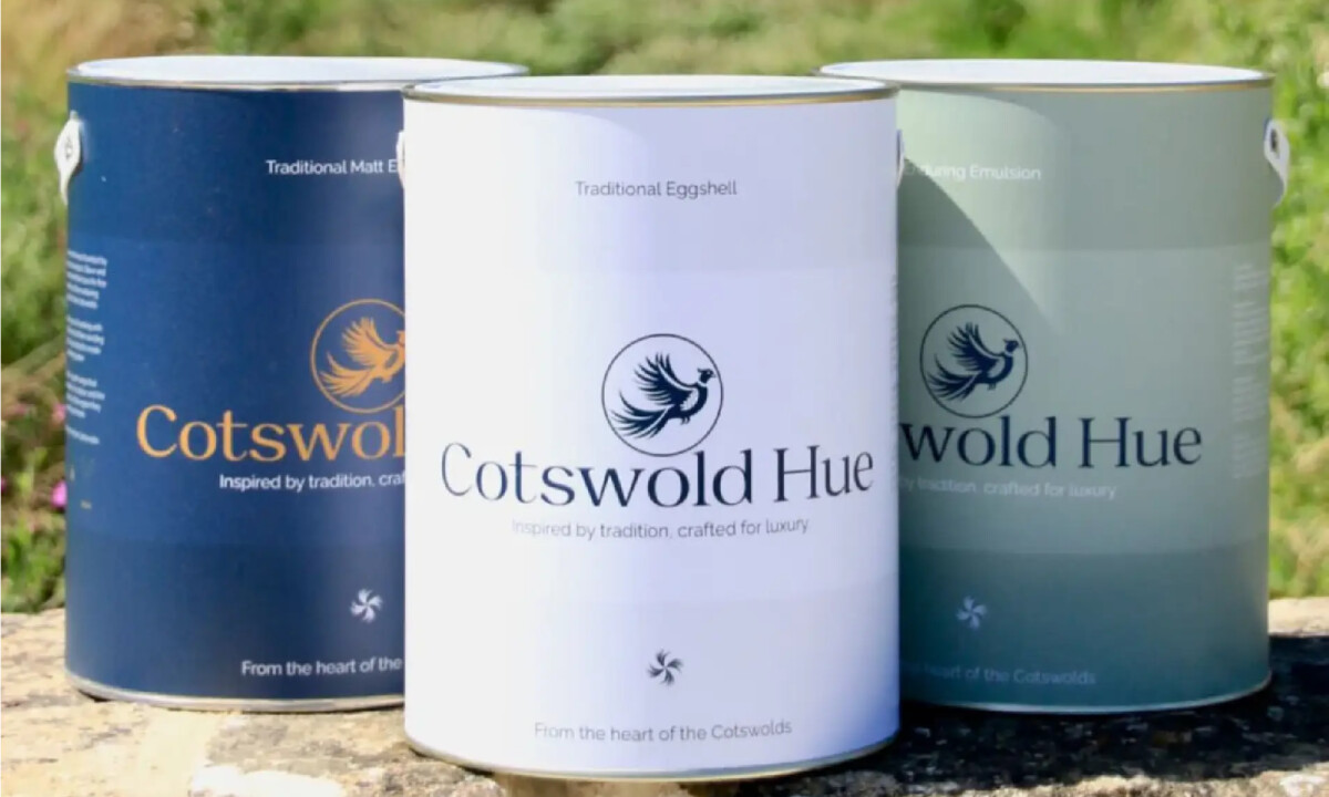
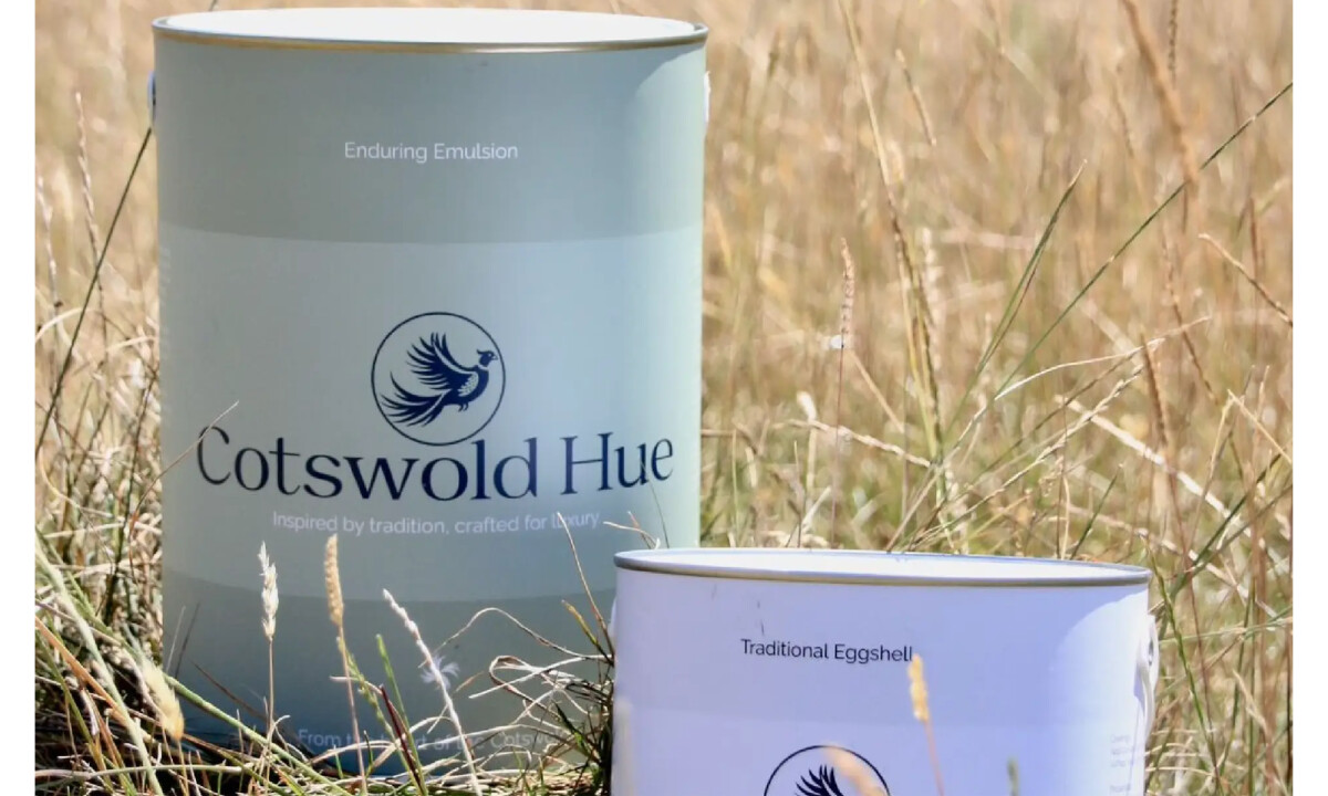
Client: Cotswold Hue Paint
Category: Packaging – Arts & Recreation
Location: Wroughton, United Kingdom
Project Brief: Design premium paint packaging that reflects countryside calm and craftsmanship while remaining timeless, tactile, and practical across tins, print, and retail environments.
Packaging Design Analysis
Related Articles:
Great arts & recreation packaging often succeeds by doing less — letting color, material, and proportion carry the experience.
The Cotswold Hue Paint achieves this through restraint, material sensitivity, and disciplined hierarchy.
- Shelf Impact: Muted, landscape-inspired color bands create calm separation without adding noise. I like how the tins read as cohesive and considered on shelf, which helps the brand hold its own in a crowded premium space.
- Information Hierarchy: A refined serif logotype carries confidence and a sense of heritage without drifting into nostalgia. I appreciate how supporting details stay understated, keeping the brand name dominant while allowing product information to scan easily.
- Structure & Consistency: The consistent banding system and spacing give the packaging a predictable rhythm across the range. This structural discipline helps the product line feel intentional and well-governed rather than decorative.
- Tactile Experience: I appreciate how the packaging extends into physical materials like color cards and brochures. Heavier stocks and restrained finishes reinforce quality and invite slower, more deliberate interaction.
Receive proposals from top packaging design agencies. It’s free.
GET PROPOSALSWhat Brands and Agencies Can Learn from Cotswold Hue Paint
Muted tins emphasize heritage and material quality


