Standout Features:
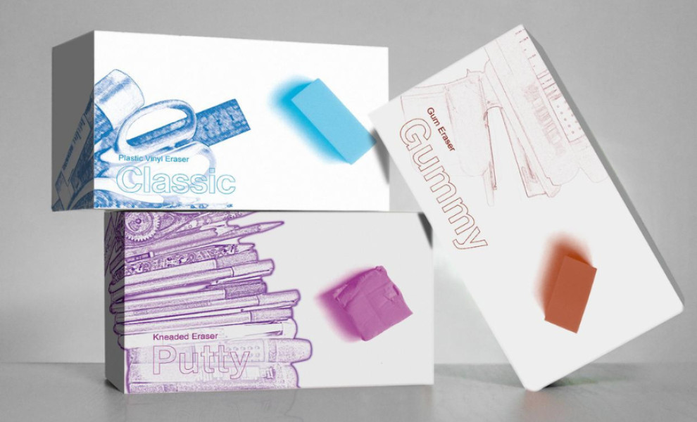
- Color-based product variation
- Clean, minimalist design
- Sketch-style illustrations
RMtheDesigner's minimalist yet artistic design for Puro erasers’ packaging elevates the typical school supply aesthetic. The collection features vibrant color-coded variations, each representing a specific variant. This approach creates visual appeal and makes decision-making for consumers easier.
The white box serves as a neutral canvas, allowing the sketch-style illustrations of pens, rulers, and other school supplies to shine. These visuals create a fun yet nostalgic feeling, making the product appealing to students and professionals.
An accompanying information sheet provides more insight into the product. This thoughtful detail shows the brand's commitment to form and function, delivering a practical, informative experience.


