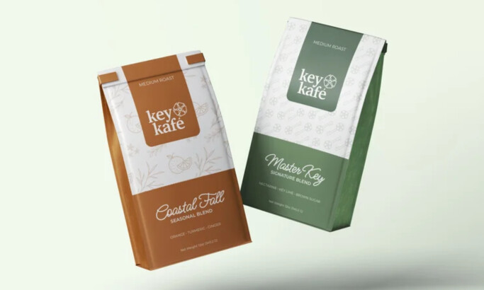
Standout Features:
- Multi-layered illustrations
- Clever use of “parasites”
- Minimal
When creating their packaging, Yindee Design walked in the path of the primary working principle of Doi Kham’s pressed mixed fruit juices – Let nature take care of nature. The brand had key visuals, i.e., fruits placed on a white background.
But let’s face it, in nature, there’s at least one insect perched on the organic fruit; creatures like dragonflies, ants, grasshoppers, ladybugs... Farmers call those insects pests or parasites. Those who only want to share the sweet fruit with you.
Since Doi Kham loves and respects nature and all of its members, Yindee placed five “parasites” as a symbol of that feeling – which is also conveyed to consumers ready to understand and join this principle. Upon closer inspection, you’ll find that each insect is comprised of its respective drink’s ingredients (or floral arrangements) which perfectly encapsulates the brand’s “circle of life” mission.
-preview.jpg)