Team Behind the Design
Packaging Design Analysis
In coffee packaging, I often look at how typography, material cues, and brand hierarchy work together to signal provenance and quality.
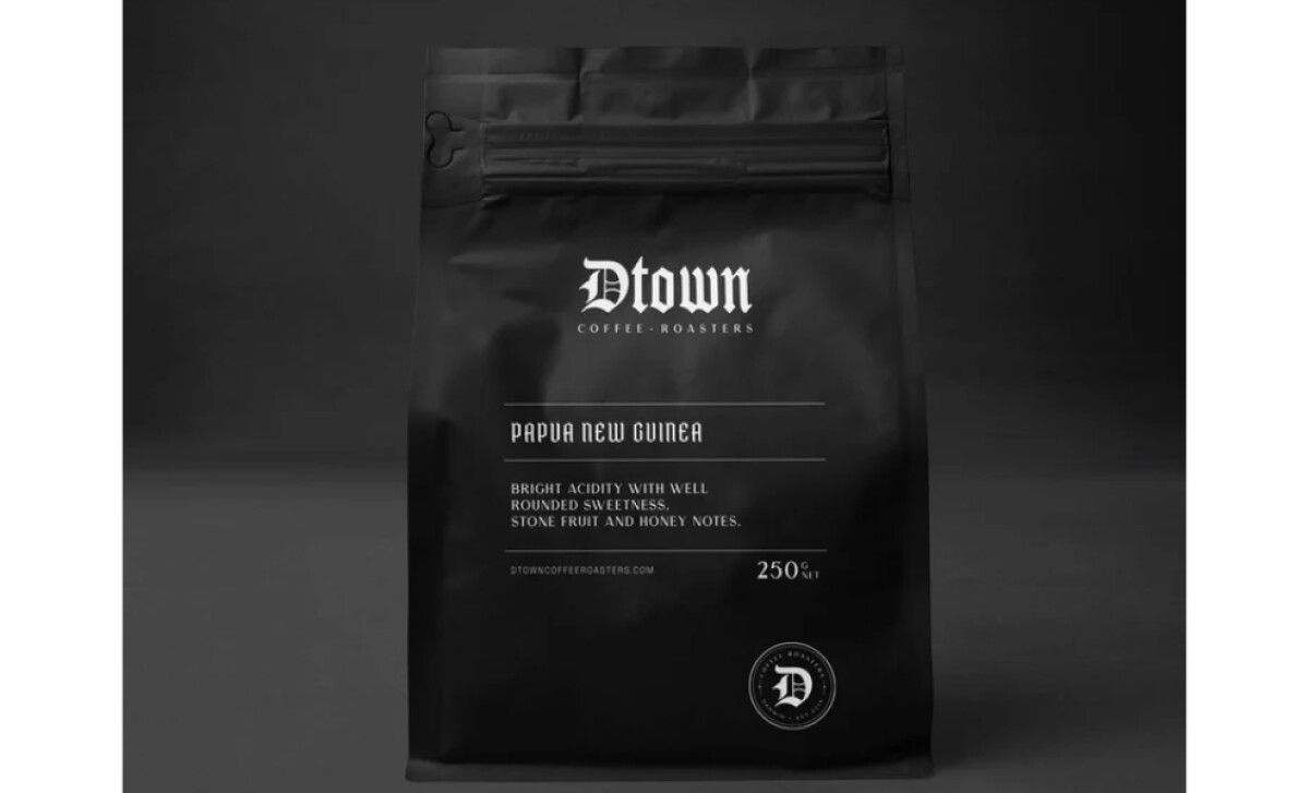
Dtown Coffee Roasters uses a heritage-inspired visual language with modern restraint, giving the brand both gravitas and contemporary polish.
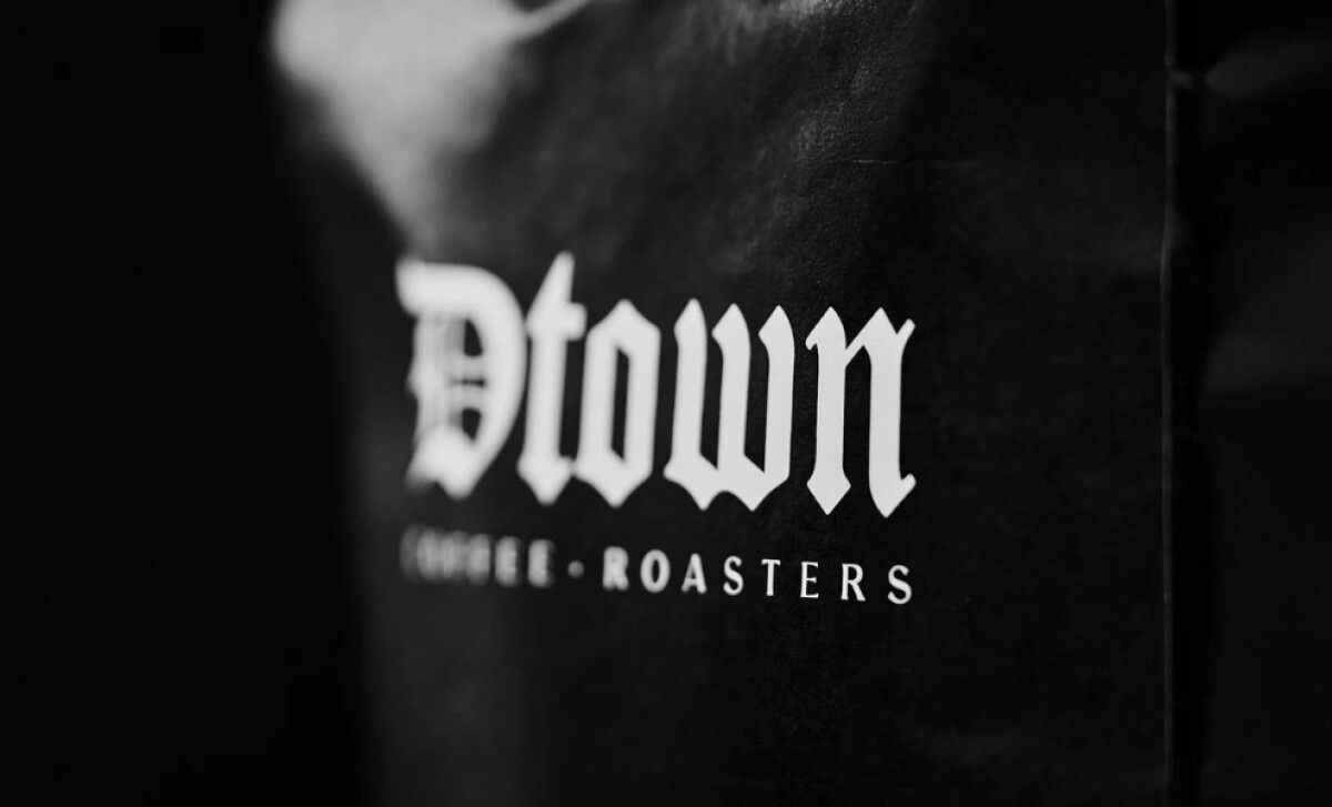
- Structure: The blackletter-inspired wordmark becomes the structural anchor for the entire system. I like how its angular strokes and sharp contrasts establish a strong, authoritative presence that breaks from the minimal sans-serif trend dominating specialty coffee shelves.
- Shelf Impact: The monochromatic palette gives the bags a premium quietness — the kind that stands out precisely because it’s understated. I appreciate how the deep matte finish amplifies the contrast of the white type, making the design feel refined and confident.
- Information Hierarchy: The addition of narrow serif typography for origins and tasting notes creates a clear hierarchy while maintaining elegance. I find the pairing of delicate serif accents with the heavy blackletter logo particularly effective in balancing readability and character.
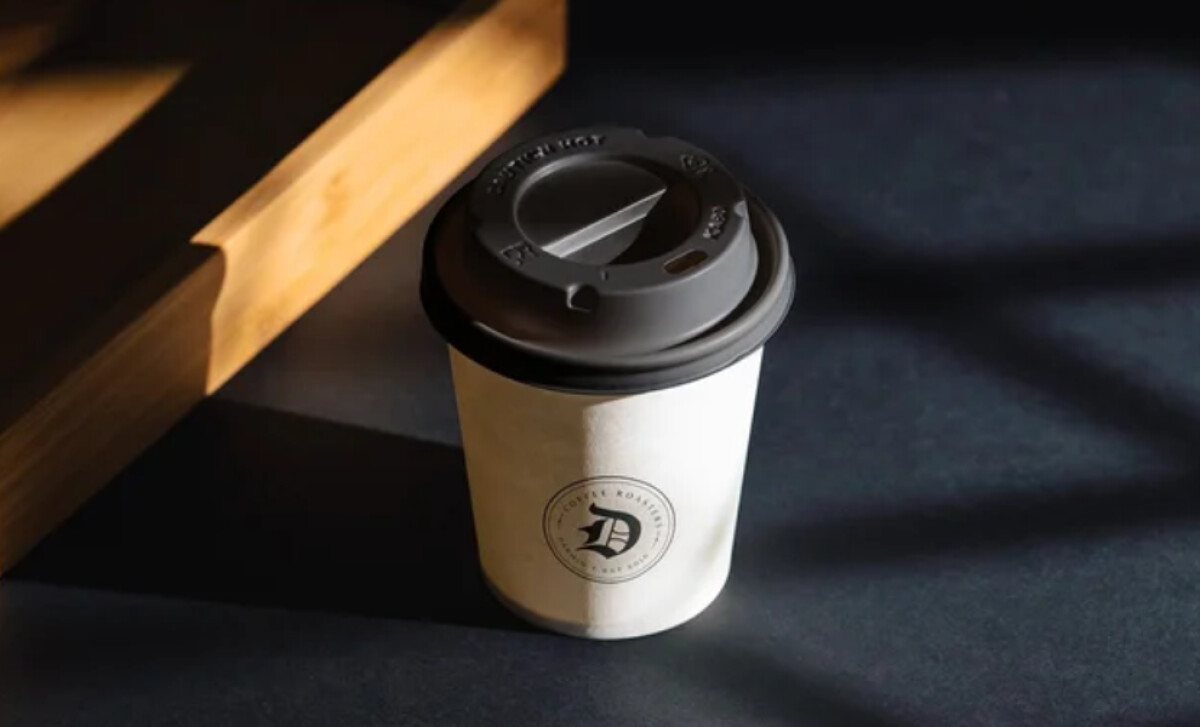
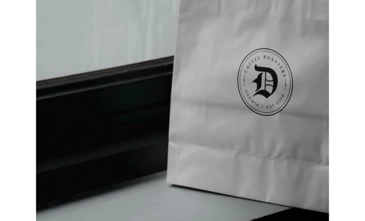
- Sustainability/Application: The circular badge featuring the Gothic “D” adds flexibility across cups, paper bags, and secondary collateral. I like how this compact seal scales cleanly and reinforces a craft-roastery feel without disrupting the minimalist layout.
What Brands & Agencies Can Learn from Dtown Coffee Roasters
Here are a few key lessons from this coffee packaging design:
1. Let Typography Carry the Brand Story
Bold typographic choices can communicate heritage and craftsmanship without relying on illustration. When the logotype becomes the hero, it immediately sets the tone for quality and authenticity.
2. Use Minimalism Strategically, Not Sparingly
A monochrome palette can elevate a product when paired with distinctive form language. By stripping away unnecessary decoration, brands can project confidence and premium positioning.
3. Create Scalable Brand Elements for Every Touchpoint
Secondary marks like badges or seals offer flexibility across smaller applications. This ensures consistency across bags, cups, and in-store materials while keeping the primary logo uncluttered.
About DesignRush Featured Designs
At DesignRush, we review hundreds of packaging and beauty projects every month. These featured works stand out for clarity, creativity, and strong alignment with brand purpose.
Only the most compelling submissions advance to our Monthly Design Awards, celebrating excellence and craftsmanship.
See more creative projects across categories:
- Best Website Designs
- Best App Designs
- Best Logo Designs
- Best Print Designs
- Best Packaging Designs
- Best Video Designs
For a full list of design agencies and related services, see our Agency Directory.


