Standout Features:
- Intricate botanical cacao illustrations
- Earthy, nature-inspired color palette
- Elegant and modern typography
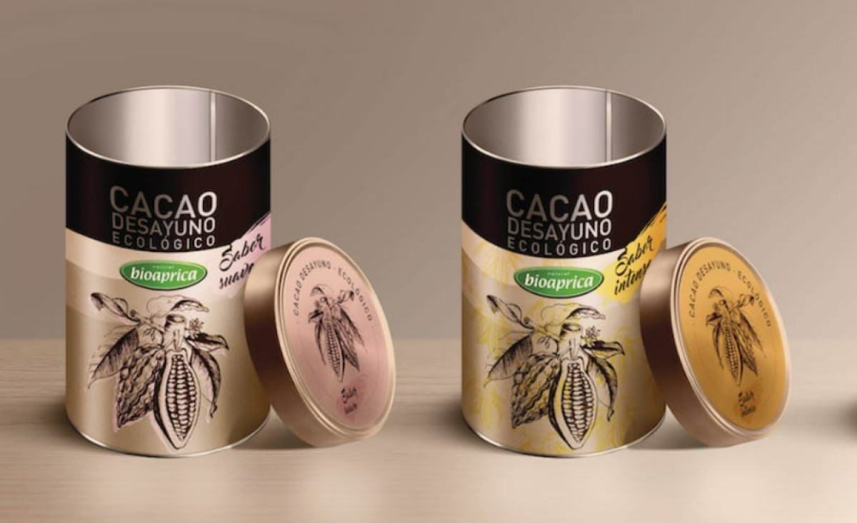
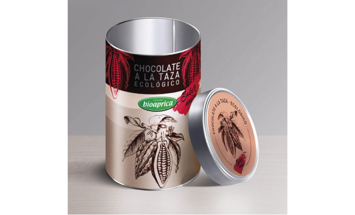
For Etiqueta Cacao Ecológico Biofood’s organic cacao range, Introagencia developed a packaging design highlighting the product's purity and authenticity. The intricate cacao pod illustrations, natural color palette, and sophisticated typography combine to create a packaging identity that feels both luxurious and environmentally conscious.
The intricate cacao pod illustrations, rendered in a vintage botanical style, immediately establish an artisanal and natural feel. These hand-drawn details evoke craftsmanship and reinforce the brand’s commitment to organic ingredients and sustainable sourcing.
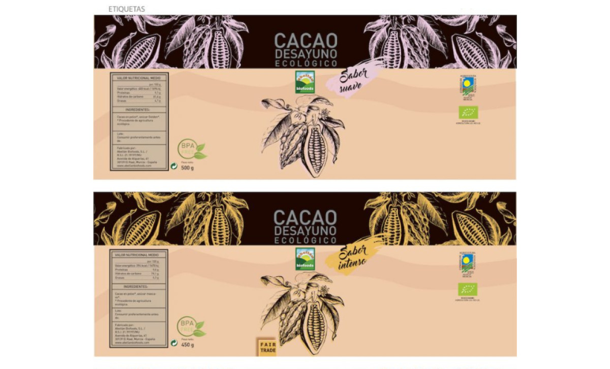
The earthy color palette further enhances the organic appeal of the packaging. Subtle beige, warm brown, and soft gold complement the dark cacao tones, creating a visually harmonious design that feels premium yet natural. The slight color variation also differentiates product flavors, making it easy for consumers to distinguish between them.
Balancing the rustic elements, the elegant typography gives the packaging a refined and modern look. A combination of bold sans-serif fonts for the primary product name and softer, handwritten accents for flavor descriptions creates a sense of sophistication while maintaining a welcoming, handcrafted aesthetic.
With this design, Introagencia successfully bridges tradition and contemporary branding, giving Etiqueta Cacao Ecológico Biofood an identity that feels both timeless and relevant. The result is a food and beverage packaging design that looks visually appealing and aligns with the brand’s values of quality, sustainability, and authenticity.


-preview.jpg)