Standout Features:
- Clever use of circles to reinforce its cheeky branding
- Minimalist typography and bold colors
- A provocative yet playful approach
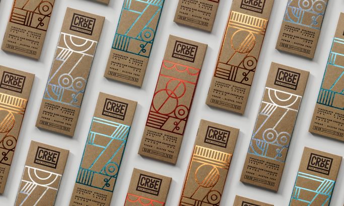
Titses Milk Chocolate doesn’t play it safe. Designed by Constantin Bolimond and Maksim Ali, this packaging leans into humor, innuendo, and bold visual cues to create something that’s equal parts eye-catching and conversation-starting. At first glance, it’s deceptively simple — clean, circular forms arranged with precision. But look closer, and the double meaning becomes unmistakable.
The packaging’s defining feature is its geometry. Two rounded chocolate pieces sit side by side, forming a design that cheekily references the brand name without veering into the crude. This clever minimalism is what sets it apart — there’s no need for explicit imagery when the shape itself does the talking. The effect is immediate: a smirk, a second glance, and, inevitably, a purchase.
Color plays a supporting yet essential role. A limited palette of bold, contrasting tones (rich browns, warm creams, and deep blacks) creates a refined yet playful aesthetic. The typography is sharp and modern, avoiding decorative flourishes in favor of clean, confident lettering that reinforces the packaging’s directness. It’s proof that humor in design doesn’t have to be gimmicky; it can be executed with sophistication.
Where most chocolate packaging leans on nostalgia, elegance, or indulgence, Titses takes an entirely different approach: irreverence. It stands out and demands attention, walking the fine line between wit and audacity. In a world of predictable confectionery branding, it proves that sometimes, a little playful provocation is exactly what the market needs.