Standout Features:
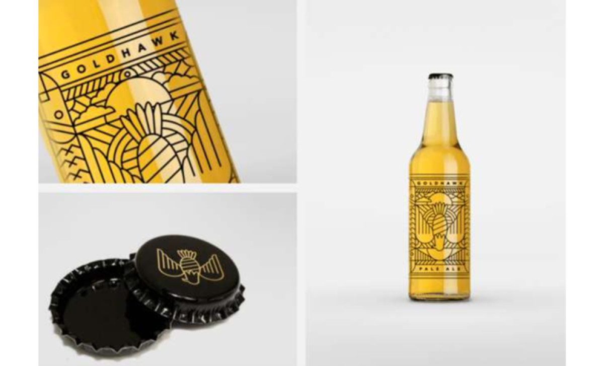
- Transparent label highlights the beer’s natural amber hue
- Bold Art Deco-inspired hawk illustration
- Minimalist style for maximum shelf impact
Goldhawk Ale doesn’t explain itself — it doesn’t have to. Don’t Try Studio strips away the excess, leaving a label that does one thing exceptionally well: it gets noticed. No text. No clutter. Just bold design choices that make the beer impossible to ignore. Logos are meant to be instantly recognizable, and Goldhawk Ale’s Art Deco-inspired hawk nails it. Sharp, angular, and dynamic (the hawk drawn in flight); it eliminates the need for words.
Now, most beer packaging acts as barriers between the product and the consumer. Goldhawk Ale flips the script. By using a transparent label, the beer itself becomes part of the design. Its golden amber hue inevitably becomes the main attraction. It’s an inspired design move that reinforces quality, authenticity, and craftsmanship.
Good design isn’t about adding. On a shelf full of over-designed beer packaging, Goldhawk Ale stands out by doing less. The clear label merges seamlessly with the glass, making it feel like part of the bottle rather than an afterthought. Consumers don’t have to work to understand it. They just see it — and buy it.
Complexity is expensive. It costs attention, time, and clarity. Goldhawk Ale proves that great design doesn’t need embellishment. The beer is the label, and the label is the beer. No distractions. Just a clear message: this is something worth drinking.