

- Agency: Happycentro
- Client: I AM ITALIANO
- Category: Packaging Design — Chocolate
- Location: Verona, Italy
- Project Brief: Create chocolate packaging that celebrates Italian culture, landmarks, traditions, and lifestyle through a collectible product experience.
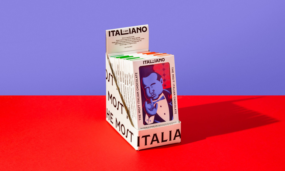
A chocolate packaging usually treats Italian heritage with rustic restraint and earth tones. Happycentro's identity for I AM ITALIANO does the opposite, weaponizing every Italian stereotype as the brand's actual visual language.
The wordmark hides "I AM" inside ITALIANO, where the inserted letters quietly form the L. A custom ITALIANO typeface anchors the whole system at every scale.
Juror Viktor Vostrowsky put it best: "A rare example of packaging that truly sparks the imagination. Italian music starts playing in your head the moment you see it, and the atmosphere instantly evokes the charm of classic Italian cinema."Lucia Barbaresso landed on the bottom line: "Stunning graphics. I am sure people will buy that product only for the packaging."
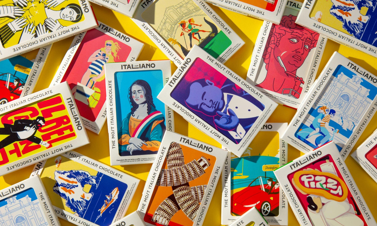
Each bar carries a different illustrated take on Italian iconography. Mona Lisa, Michelangelo's David, and Botticelli's Venus sit alongside pizza neon signs, an Italian Job-style red sports car and a tuxedoed man pinching his fingers.
Kitty Lai pointed to one of the more considered details: "Really eye-catching use of illustration, and love that the chocolate mould itself is shaped into all the classic Italian hand gestures, such a fun nod to the culture. Plus the postcard hidden as part of the packaging is a lovely touch."
The packaging front doubles as a collectible postcard, hidden until the bar is opened. Happycentro turned every cultural cliché into deliberate design material, so a tourist souvenir reads as a designer object.
The last word belongs to the design itself. Pablo Teran called it "a great project that enhances the Italian icon with a fun, simple, and charming language, using the right variety of cultural archetypes it represents."
Viktor Vostrowsky fell for it entirely: "Beyond the beautiful visuals lies an exceptional system — creating an experience that extends far beyond the packaging. Mi sono innamorato di questo progetto."
Some packaging makes you want to buy the chocolate. This one makes you want to keep the box.