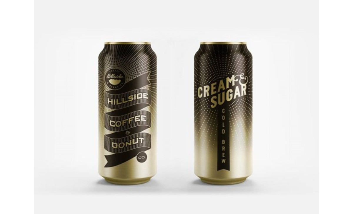
Standout Features:
- Luxurious, gold-based color palette
- Contemporary, heavy sans-serif typography
- Concentric, shine-evoking pattern
Hillside Coffee’s packaging, crafted by This is EME, exudes premium quality through every design detail. The luxurious, gold-based color palette is the cornerstone of its appeal. Rich metallic golds blend seamlessly with deep browns, evoking a sense of extravagance, warmth, and tradition.
Complementing this lavish palette is the contemporary, heavy sans-serif typography. Bold and unmistakable, the clean lines of the typeface establish a modern yet enduring brand presence.
Enhancing the design further is a concentric, shine-evoking pattern. This subtle yet striking pattern of dots catches the light, creating an almost ethereal glow that draws the eye and highlights the premium branding. It’s a visual nod to the intensity of flavor hidden within each bean.