For a delicious coffee that provides a kick, Ikea wanted a packaging that provided a similar power. When you think of coffee, you think, “bold.” The result of the design process is this bold packaging design.

The packaging is very consistent across all varieties of coffee sold by Ikea. Each unique variety has an illustration that represents the type of coffee bean inside. Other than that unique feature, the bags are largely the same. The typography on the illustrations is fun and creative, like something you would see at a trendy coffee bar.
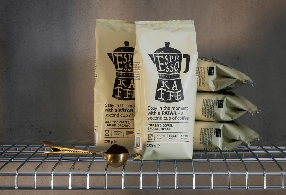
While the design is bold and the illustrations stand out, the packaging also has a minimalist element to it. This is aligns with Ikea’s brand image on many of their products. Ikea stores often have a minimalist feel, and this packaging will fit right in on their food shelves.
Overall, the design gives a feeling of quality, no-frills coffee. Without even tasting it, customers will see an affordable, high-quality product—much like the rest of Ikea’s goods.
Ikea Patar is a great packaging design in the Food & Beverage industry.