Standout Features:
- Die cuts showcasing artwork
- Simple and elegant typography
- Striking pops of color
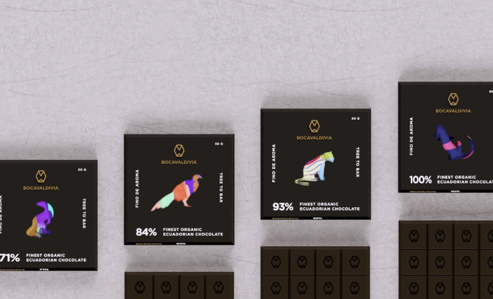
Andres Pacheco Erazo’s unconventional packaging design for Bocavaldivia Chocolate turns a simple package into a marvelous piece of art.
Each chocolate bar tells a story by showcasing beautiful artwork hand-drawn by community children. The die-cut detail provides a direct window into these artistic pieces, making every package uniquely captivating!
The Bocavaldivia logo and chocolate bar descriptions are rendered in a bold and straightforward typeface. This allows the colorful artwork to take center stage while ensuring the brand name and essential product labels are concise and easy to read.
The best part? A spectrum of colors catches the eye and represents Ecuador's rich, diverse culture. Every shade contrasts perfectly with the package’s sleek, dark background. This palette enhances the packaging’s artisanal feel and adds a contemporary touch.