_e3f29eaf3b7b-desktop.jpg)
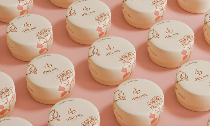
Standout Features:
- Color-blocked packaging
- Highlights product flavor
- Legible texts on all sides
Incredible Eats gets together with Little Fox Design to put up a unique food product packaging that’s fun and eye-catching.
The contemporary brand benefits from a hip user interface design, brilliant colors, appealing fonts and quality content. There’s no question that customers get enticed by its products after the first look.
If there’s one staple color in their sustainable packaging design, it’s white. It spotlights the products putting the packaging front and center. The agency used bright colors that best represent the product inside. Blue, orange, green, and red are just some of the options you’ll see.
The enticing photography isn’t something to be ignored. Each image complements the product well and matches the whole theme beautifully. The agency utilizes very little from the food and desserts to the plate toppings. Everything comes together for an aesthetically pleasing sight. And more importantly, the elements do not overpower the edible spoons, which are Incredible Eats’ main product.
Also, the agency made sure not to leave the typography behind. They used a round typeface for easier readability and spaced each piece of content just right without overshadowing the main product shot.
To cap everything off, Little Fox Design assembled a sustainable and eco-friendly packaging design that allows the brand to carry out its purpose with ease. The idea is to eliminate distractions and make way for easy and efficient shopping. It’s not easy to get food packaging right the first time, but this design hits the nail on the head.

-preview.jpg)
-preview.jpg)