- Agency: Lioness Design
- Client: d’lite bite
- Category: Packaging – Food & Beverage
- Location: Kansas City, Missouri, United States
- Project Brief: Develop a logo and packaging system for a health-focused sweets brand that communicates indulgence without guilt, prioritizes sustainable materials, and considers the full user interaction from first impression to unboxing and reuse.
Food packaging design often struggles to feel indulgent without sacrificing trust or restraint.
The d’lite bite addresses this by treating packaging as a tactile, emotional object rather than a purely informational wrapper.
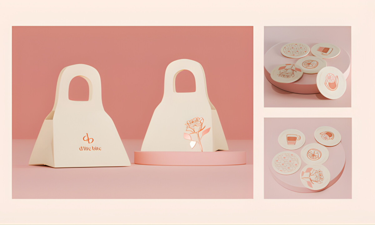
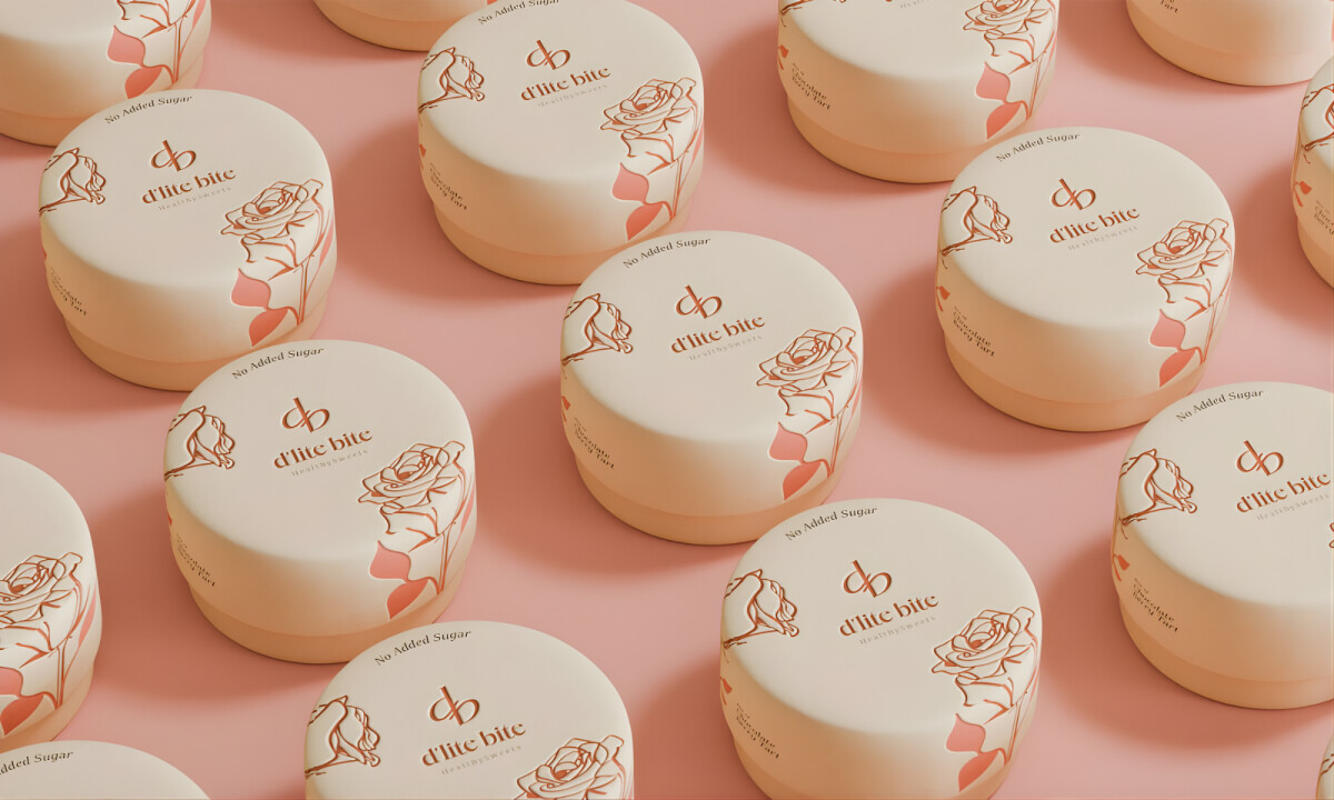
- Form & Physical Presence: Rounded containers and softly proportioned packaging establish an immediate sense of warmth and approachability. I like how the forms feel intentional and substantial without reading as bulky or wasteful.
- Illustration & Surface Restraint: Line-based illustrations and subtle patterns add personality while leaving space to breathe. This restraint keeps the packaging decorative without turning it into novelty, allowing the product to feel timeless rather than seasonal.
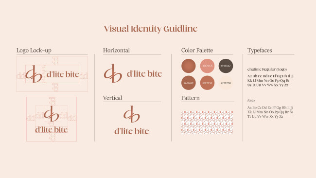
- Color & Emotional Tone: Muted pastels and warm neutrals set a gentle, reassuring mood. I appreciate how the palette avoids common “health food” tropes, positioning the brand closer to boutique confectionery than functional snack.
- Interaction & System Logic: Every component reflects how the product is opened, handled, and reused. Modular sizing and flexible layouts make the system scalable across flavors and formats while preserving a consistent shelf and unboxing experience.
What Brands & Designers Can Learn from the d’lite bite Packaging Design
1. Treat Packaging as a Sensory Object
Rounded forms and soft proportions create an immediate emotional connection before the product is opened. Physical presence plays a critical role in shaping perceived quality and comfort.
2. Use Restraint to Achieve Timeless Appeal
Minimal illustrations and breathing room prevent the design from feeling novelty-driven. When decoration is controlled, packaging remains relevant beyond trends or seasons.
3. Design Systems Around Real Interaction
Considering how packaging is opened, handled, and reused leads to more thoughtful, scalable solutions. Functional logic strengthens consistency across flavors while improving the overall experience.