
Lush colors. Mouth watering fonts. Unique product design. This is what best packaging design is all about. The fit lifestyle health trend as increased year after year. In 2017, the trend shows no signs of slowing down. Consumers want more choices and healthier, organic products to improve their health. Back off, V8 juice. Your reign has crumbled.
Welcome to JUS. JUS (Juice Up Saigon) is a completely new, raw, cold-pressed juice company. It sounds refreshing just typing that description. JUS tasked M—N Associates agency to produce a completely new brand identity and packaging design that makes it a fine example of best packaging design.
First, more about the company. JUS owes its humble beginnings in September 2015, where three people whom shared the same love for a healthy life, lived in Saigon, one of the most bustling cities in Southeast Asia. Those three people were Anh Nguyen, Hao Nguyen, and Misa Vu. They came up with a juice product that has more than 0.5-1kg (for 250ml) of raw organic fresh vegetables and certificated fruits in it.
The juice is cold-pressed via hydraulics and contain zero preservatives and thus, a short shelf-life. M—N Associates had a mission to create a visual packaging design identity for the completely new product in Vietnam. This is a mission about creating a design for a pioneer that broke the barrier to an untapped market.
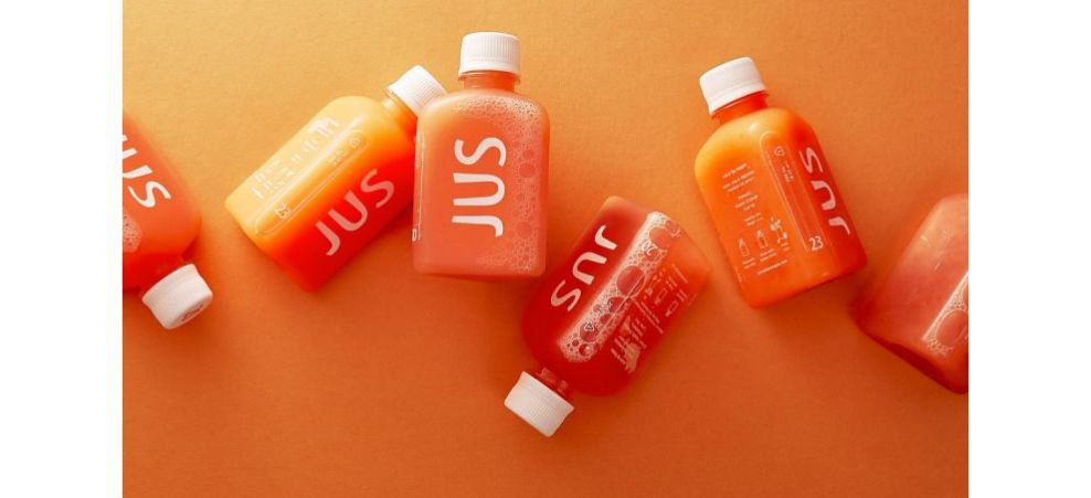
They created a bottle shape based on the concept of the equilateral triangle of yoga that connects the mind, body, and spirit, into one. The wonderful colors of the juices shine through the clear bottles that remind me of antidote bottles used to revive your characters health in a videogame to 100 percent. Good as new.
The logo design includes organic curves and unbalances arms to highlight the natural organic ingredients of the brand.

An icon system was created with bright and vivid colors with fruits and vegetables. The cards seen here contain one side with information and another with two elements: the fruit and a lush color. It looks as natural as the JUS product. No preservatives, no fluff, pure cold-pressed nutrient heaven from the fruit and vegetable gods themselves.
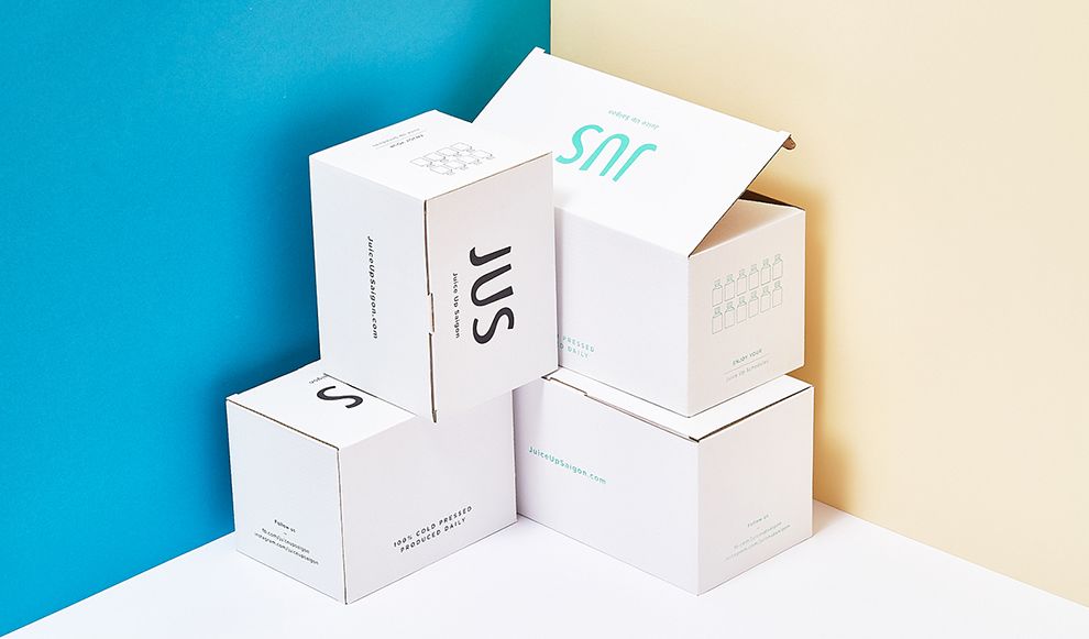
The box packaging is a vivid white, representing purity and heavenly bliss and illumination. Within these boxes contain the very first cold-pressed juice product to enter Vietnam. The gates to glory await.
M—N Associates created a packaging design that ranks among the best. They used simplicity, lush and vivid colors, and incorporated the concept of the equilateral triangle of yoga to convey the healthy and blissful lifestyle that juicing provides. Customers will see that this is not merely another juice product. This is a beverage that will enhance your mind, body, and soul.
Even the fruit and vegetable icon system incorporate minimalistic elements that convey the purity of the product through the use of iconography and lush color. From the unique bottle shape to the ideological concept of peace through health, this example of best packaging design is sure to move mountains in Vietnam.
Don’t forget to check out our other best packaging design articles as well as best designs in logo and other categories to fuel your inspiration and help you be the best designer you can be.
JUS Branding is a clean packaging design in the Food & Beverage industry.
-preview.jpg)
-preview.jpg)