Key Insights for Brands:
- Diverse cultural motifs foster global appeal and inclusivity
- Simple typography and clear hierarchy enhance product information and visual appeal
- Unique shapes, textures, and finishes create a premium brand image
PikZiy Studio Uses Global Design Elements to Reflect Alchime’s Universal Appeal
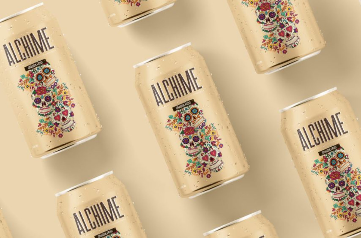
With a focus on gut health, Alchime sought packaging for its alkaline beer brand that would resonate with a diverse, global audience. They partnered with PikZiy Studio to create a unique design incorporating various cultural elements.
The designers masterfully achieved this feat by using creative yet recognizable cultural motifs. From the captivating illustrations of goats, dragons, and skulls to intricate floral patterns and barrels, each symbol speaks to the brand's worldwide reach and connects with different regions.
The eclectic mix of 2D illustrations further positions the brand as inclusive. This style celebrates Alchime's cross-cultural relevance and invites consumers from all backgrounds to experience the unique beverage.
Check out the best beverage designs of 2024.
The Packaging Design Emphasizes Key Product Information With Simple Typography
-desktop.jpg)
Alchime shines among the best packaging designs with its clear labels. The brand name and its flavor variant are prominently displayed on the packaging, ensuring quick recognition for consumers.
The font choice strikes a balance between functionality and aesthetics. It offers a clean and modern look that allows key product details to stand out while complementing the visual design. This simplicity makes the product easy to identify, enhancing its overall appeal. The placement of the text at the center keeps the focus on the brand name, while the smaller text provides supporting details without cluttering the layout.
Overall, the thoughtful use of typography enhances the visual hierarchy. It naturally guides the consumer's eye from the brand name to the flavor, helping them spot and engage with the product at a glance.
Need more creative inspiration? See our list of the best beer label designs of 2024.
The Beer Can’s Unique Shape and Texture Enhance the Product’s Shelf Appeal

Alchime's slim can immediately set it apart from traditional beer packaging, providing a sleek, modern look that attracts attention. This design choice enhances visual appeal and showcases the brand's unique alkaline beer. The slimmer profile suggests a lighter, more refined beverage.
Discover more stunning examples of modern packaging designs.
Additionally, the slim can's ergonomic design makes it comfortable to hold, subtly enhancing the consumer's interaction with the product. This technique is employed by top-notch packaging design agencies, where visual appeal is complemented by physical engagement.
Plus, the use of a matte finish adds a tactile quality. It further distinguishes the product and reinforces its premium, sophisticated image. This attention to shape and texture helps Alchime make a strong visual impression on store shelves and entices curious consumers.
Alchime’s Color Palette Appeals to a Diverse, Health-Conscious Audience

The design's bold and playful color palette appeals to a universal audience who prioritize their health while indulging in a delicious drink.
Earthy tones like soft browns and muted greens reflect the brand's natural ingredients and health focus. Meanwhile, vibrant accents of yellow and blue add energy without overpowering the design. This harmonious blend evokes freshness, aligning perfectly with Alchime's mission to offer a unique and gut-friendly beverage.
Explore more colorful packaging designs that pop.
Alchime's packaging effectively communicates its commitment to global inclusivity and gut health by blending cultural elements, clean typography, and engaging visuals. This attention to detail and high level of creativity make it a deserving winner of the coveted Design Awards.

-preview.jpg)
-preview.jpg)


-preview.jpg)
-preview.jpg)
-preview.jpg)