Standout Features:
- Muted colors differentiating coffee origins
- Subtle tone-on-tone goat illustration
- Highly consistent layout
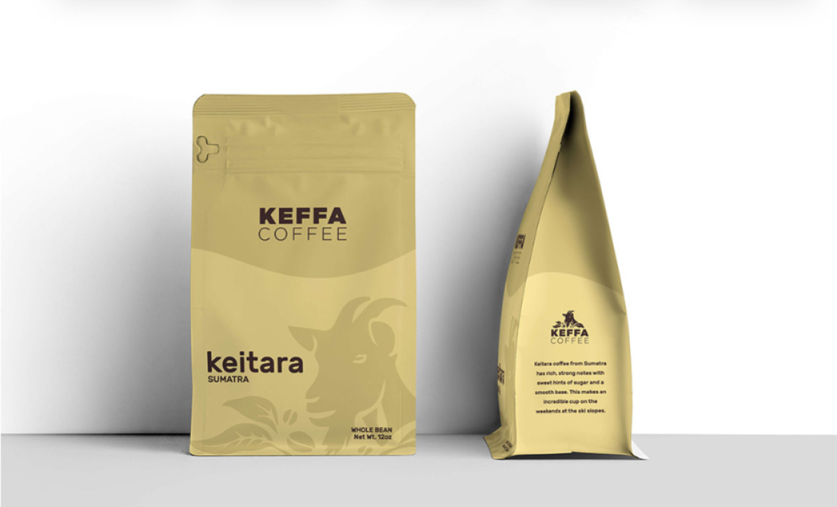
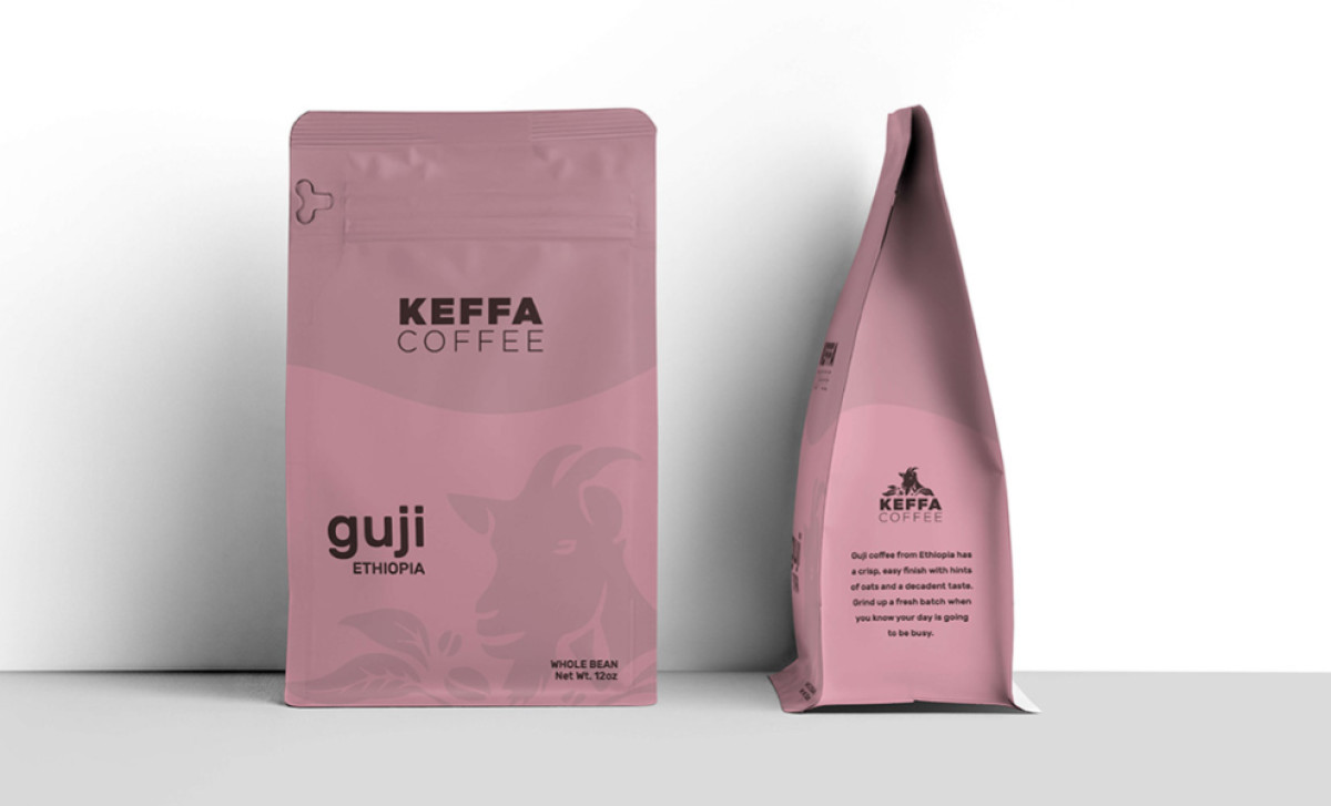
Keffa Coffee is about much more than just the coffee itself; it's focused on communicating values like quality, ethical direct trade, environmental sustainability, and its deep heritage. So, their packaging, which was designed by Eddie Imparato, needed to subtly yet effectively communicate all of these important underlying values to consumers.
First off, the system effectively uses a palette of classy, muted, earthy colors (like tan or sage green) as the main background for each different coffee pouch. This separates the origins of each coffee product nicely for the consumer. Plus, it makes the whole product family look elegant and cohesive, feeling both premium and connected to nature.
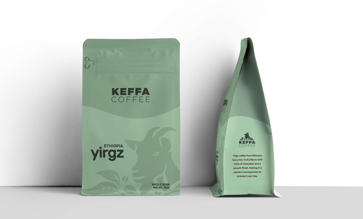
A nice touch is the stylized drawing of a goat, done subtly tone-on-tone on every package here. This repeating image nods to the coffee's origin story, adding story to the packaging and a nice surprise for consumers, since the design is so subtle. Like the colors, it also ties the product line together as a consistent thematic element.
Finally, the layout and fonts are super consistent across all the different coffee pouches. Each one features the brand name prominently at the top, origin details centrally, and functional info below, all in clean sans-serif type. Doing so makes it easy for the brand’s customers to identify Keffa Coffee products and select the desired origin or type.
This packaging design manages to balance a tangible connection to its origins and a premium feel. If you're aiming squarely for the high-end natural, organic, or specialty market segment, this beverage packaging design is a blueprint example of how to appeal strongly to consumers who clearly value both authenticity and quality presentation.