Standout features:
- Festive elements
- The melding of youthful and traditional
- Colorful
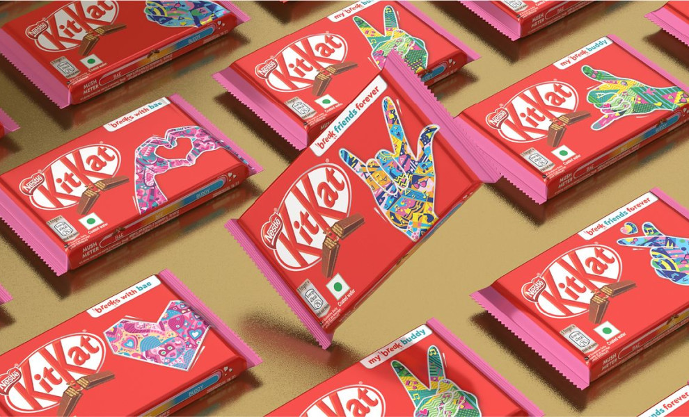
Adorning an already iconic packaging can be more challenging than working from scratch. However, PRAKRIA managed to seamlessly reinvent the famous KitKat wrapper while also staying within the confines of what makes the product so memorable.
Heading towards the festive season in India, KitKat, by its very nature a very youthful & vibrant brand, aimed to merge its dominant features with the traditional, albeit colorful aesthetics of the local customs.
It was a challenge that required out-of-the-box thinking, but at the same time, it required functioning within certain guardrails.
PRAKRIA's solution started while designers were “Having a Break.” In one of those breaks, inspiration came to mind: “Why not CELEBREAK instead of Celebrate?”
Dialing up the verbal expressions - WOW and JOY, PRAKRIA came up with Paisley as the chief design element.
They’ve interwoven the traditional festive elements in a youthful design language jutting out of the classic KitKat Snap, capturing the celebratory spirit through the snap element. The packaging design inspiration is a curious case of “the more you look, the more you’ll see.