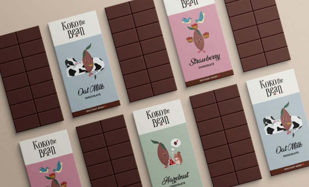
Standout Features:
- Heartwarming illustrations
- Pastel color palette
- Handwritten and sans-serif font
Kristina Belotskaya‘s packaging design for Koko the Bean fuses warmth, tenderness, and clarity, embodying the brand's vegan-friendly ethos.
The main element of the packaging is charming illustrations of cocoa bean-feeding animals, which create a vegan-friendly atmosphere. These delightful drawings capture the essence of compassion and kindness central to veganism and establish an emotional connection with the consumer.
The use of a pastel color palette evokes this feeling of gentleness. Soft hues like light pinks, greens, and blues create a soothing and inviting visual experience. This choice of colors enhances the heartwarming illustrations and reinforces the overall sense of care and delicacy.
Combining handwritten and sans-serif fonts adds an effective communication layer to the packaging. The handwritten font injects personality, making each variant look unique and carefully crafted. On the other hand, the straightforward sans-serif lettering ensures that the essential information is conveyed legibly.

-preview.jpg)
-preview.jpg)
-preview.jpg)