Standout Features:
- Playful character illustrations
- Bold, vibrant color differentiation
- Story-driven packaging with personal touch
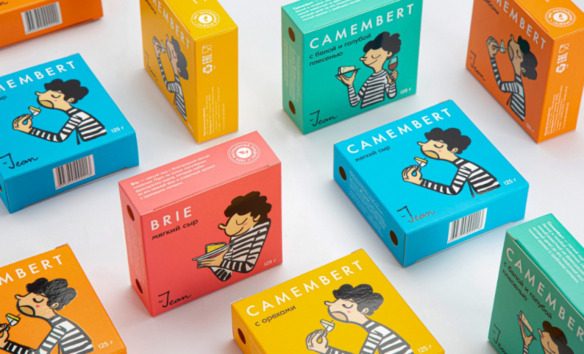
Jean Cheese, a delightful dairy brand, offers a range of cheeses that are not only fresh and flavorful but come with an engaging, unique brand personality. The packaging, created by Ferma Branding Agency, brings this personality to life with a thoughtful and whimsical design that blends vibrant visuals with interactive storytelling.
The playful character illustrations of Jean are a standout feature. Each box showcases a quirky depiction of Jean himself, adding a personal and relatable touch to the product. His expressive character makes the brand feel approachable, while conveying the fun, indulgent experience of enjoying cheese.
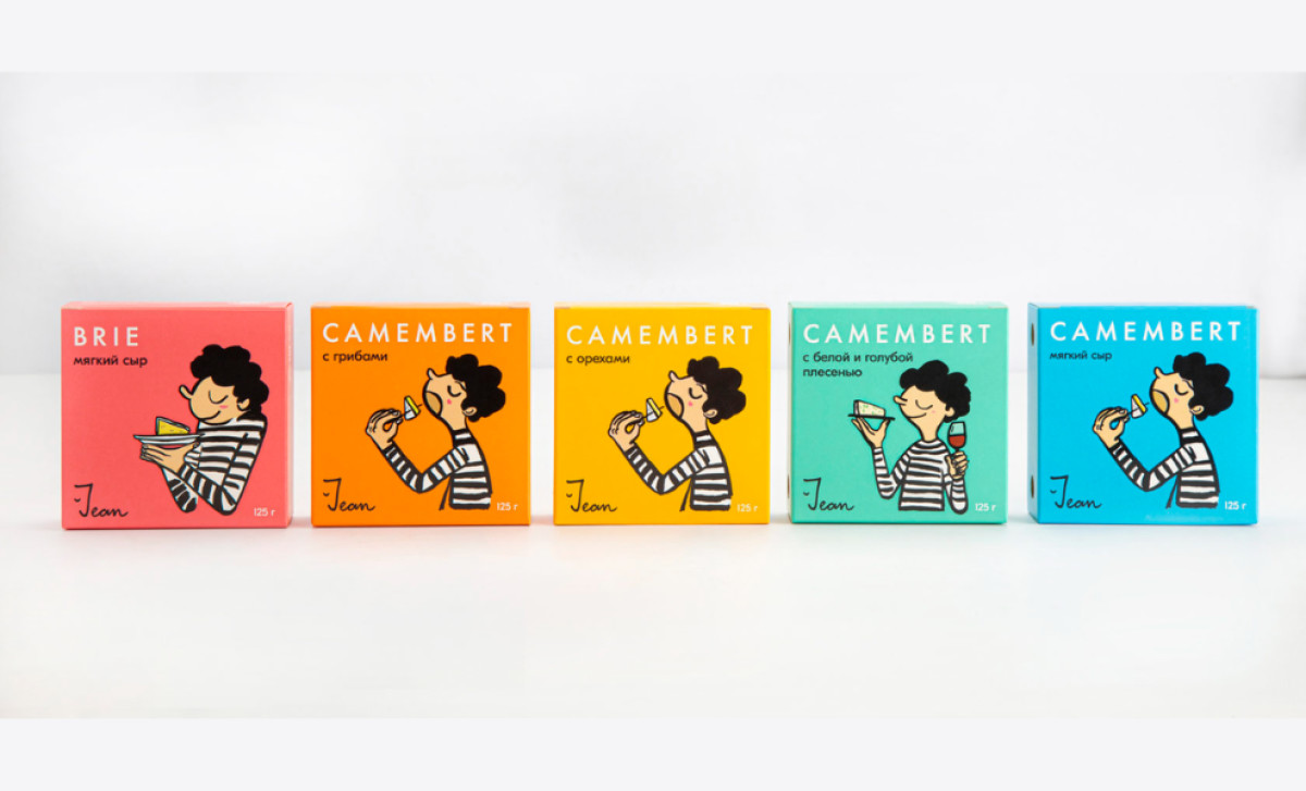
Color differentiation is used effectively to distinguish the various cheese flavors. Bright, bold colors — such as vibrant blues, oranges, and greens — ensure that each variant is easily identifiable. This color-coded system allows consumers to quickly navigate the different products, enhancing convenience while making the packaging pop on shelves.
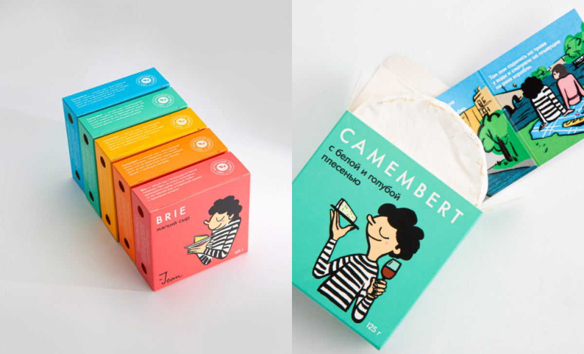
The packaging also tells a story, with engaging anecdotes about Jean’s life and his relationship with Marie, his girlfriend. These stories appear as inserts and are directly tied to the consumption experience. This thoughtful approach shows how Jean’s cheeses can be enjoyed in various ways, from wine pairings to creative recipes.
Overall, Ferma Branding Agency’s dairy product packaging design for Jean Cheese is highly effective in connecting with consumers, using colorful, character-driven visuals paired with informative and personal storytelling. It transforms the act of buying cheese into a fun, memorable experience that not only informs but also entertains.


-preview.jpg)
-preview.jpg)
-preview.jpg)
-preview.jpg)