Standout Features:
- Rose gold lettering
- Dark, luxurious bottles
- Serif typeface
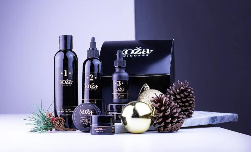
KHreative Works' packaging design for Koza Skincare adopts a minimalistic approach to encapsulate luxury and sophistication. The rose gold lettering perfectly aligns with the brand's name, which means "skin" in Croatian. This simple typographic element evokes softness, femininity, and an elegant appeal.
The dark, luxurious bottles further enhance the sophistication of the packaging. Black is a timeless color often associated with premium quality, making it an ideal choice for conveying Koza Skincare's upscale nature. In addition, dark bottles create a striking contrast with the rose gold lettering, enhancing the design's dynamic.
The serif typography adds a layer of classic charm to the design, reinforcing the brand's refined products. Overall, this packaging design underscores the brand's focus on purity and quality, aligning with the skincare industry's values of simplicity and effectiveness.