Standout Features:
- Hyper-saturated pop art color palette
- Dimensional “V” icon as a brand anchor
- Neon-tropical contextual styling
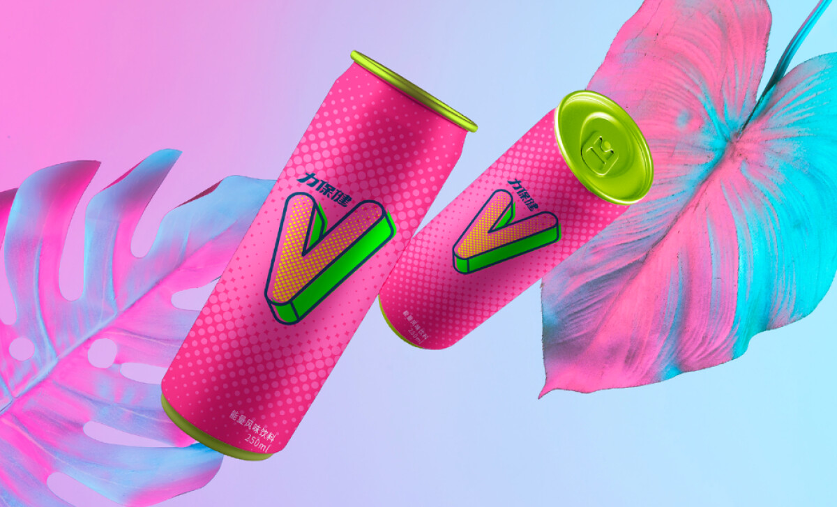
In a sea of generic metallic cans, the redesigned LIVITA energy drink is a blast of color. The packaging is a masterclass in maximalism and a perfect fit for a product designed to be sold in nightclubs and consumed by a youth audience.
A vibrant, fluorescent hot pink covers the can, which features a halftone dot texture for a retro, comic-book feel. An electric green “V” with a neon yellow fill is outlined in a thick navy blue, completing the pop-art punch.
The beverage packaging design is a perfect example of a color scheme that commands shelf space. It’s a bold choice that instantly separates LIVITA from its competitors.
The palette feels energetic and is completely aligned with the product's purpose, a critical consideration as a staggering 85% of shoppers cite color as a key reason for their purchasing decisions.
Speaking of that large, dimensional “V” icon in the middle of the can, notice how it's been given a 3D treatment with a strong perspective. This, combined with the exaggerated shadowing, makes it a very powerful and eye-catching brand mark.
This is a great case of typography becoming iconography. The “V” is a simple but highly effective design asset that provides the brand with a unique and ownable symbol that is full of energy and personality.
In the product photography, the cans are surrounded by neon-tropical leaves. The leaves are rendered in the same oversaturated pinks and cyans as the can. The background gradients also shift from electric blue to soft violet and magenta.
These contextual visuals help to extend the brand’s universe far beyond the can itself — one that is steeped in electronic music, neon lights, and a sense of curated chaos.
thisnothat Design Studio's work design is a triumph of understanding the target market. The takeaway for other brands is that a design that speaks the same visual language as its audience will always feel more authentic and appealing.
The real challenge in designing for a specific audience is to create a look that speaks their language, and a bold, confident design is often the best way to do it.
That's why brands turn to expert partners, and our team has ranked the best agencies worldwide to make finding them simple.
Visit our Agency Directory for the Top Packaging Design Companies, as well as:
Our design experts also recognize the most innovative design projects across the globe. Visit our Awards section to see the best & latest in packaging design.

-preview.jpg)