Standout Features:
- Straightforward typography
- Minimalist design
- No-frills presentation
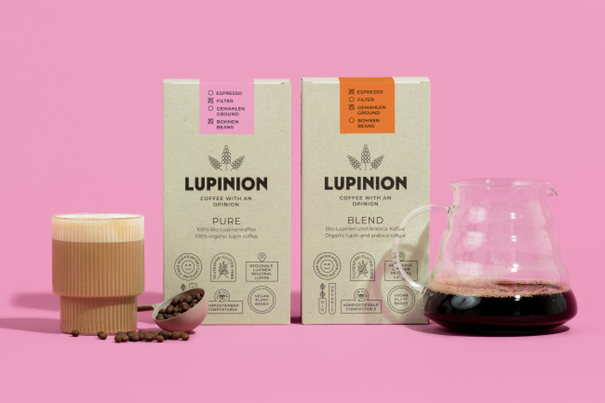
More than just a drinking option, Lupinion is a coffee brand with strong opinions.
And Franziska Bottcher Studio captured this brand image in their designs. The agency devised a cardboard packaging design inspired by expensive boutique cafes on the streets of Paris!
The typography is neat and simple. No ho-hums, no gibberish. -- a straightforward font style helps the design send the message across efficiently. Also, this clean typography highlights the product so well.
The design also looks polished. The minimalist design worked like a charm.
This lighthearted yet meticulous approach to the cardboard packaging design lets the buyer draw their attention to the packaging first, then get intrigued by what a cup of Lupinion coffee tastes like. Overall, the design fits like a glove, and we are sold.