Team Behind the Design
Packaging Design Analysis
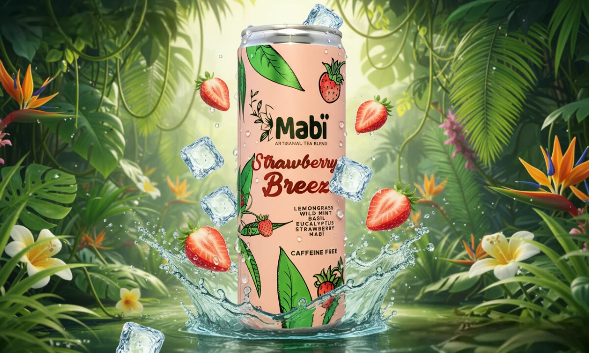
When I look at heritage-led beverage packaging, I pay attention to how clearly the design communicates origin without feeling dated.
Mabï Artisanal Tea works because it treats history as something living, translating it into a contemporary system rather than a nostalgic throwback.
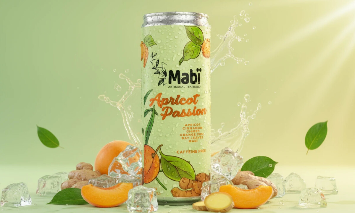
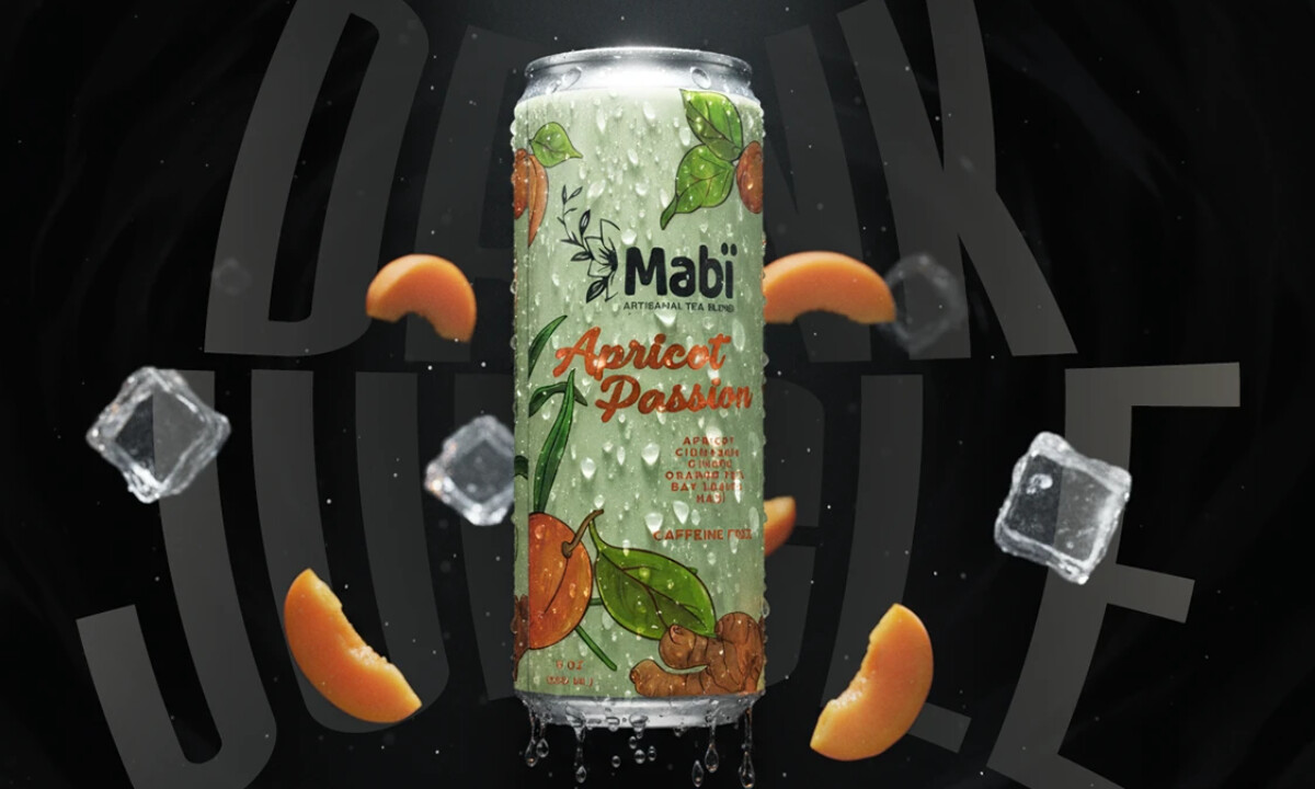
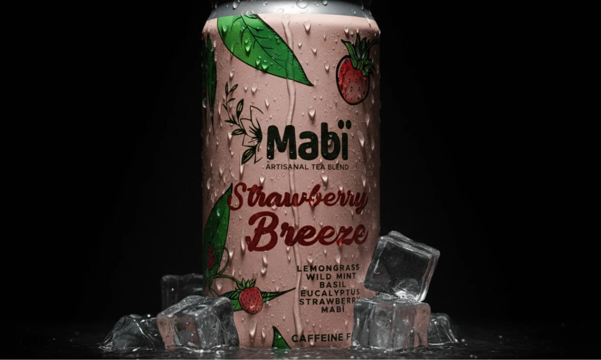
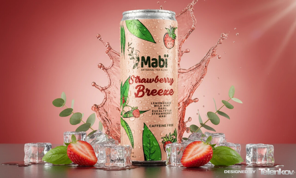
- Illustration: The hand-drawn botanical illustrations are the heart of the packaging. I like how the line work stays imperfect and organic, with leaves, bark, and fruit feeling observed rather than polished. Wrapping the illustrations around the can turns the surface into a narrative rather than a simple label.
- Typography: The typographic hierarchy feels considered and calm. The brand name stays clean and readable, while flavor names introduce a more expressive, brush-like style. I find this contrast effective because it reflects the product itself, rooted in tradition but driven by sensory experience.
- Color: Each flavor relies on muted, nature-driven base tones like soft greens, blushes, and warm neutrals, supported by brighter illustration details. The palette feels intuitive instead of trend-led, which gives the range longevity. Nothing reads as seasonal or disposable.
- System & Consistency: Even with illustration-rich surfaces, the layout remains disciplined. Logo placement, proportions, and hierarchy stay consistent across variants. From a system perspective, that consistency is what allows the brand to scale while remaining easy to recognize.
What Brands & Agencies Can Learn from Mabï Artisanal Tea
1. Heritage Without Nostalgia
Cultural history does not need retro cues to feel authentic. Mabï shows how heritage can read as current when expressed through material choices, illustration, and restraint.
2. Let Illustration Tell the Story
Used with control, illustration becomes narrative rather than ornament. Here, it adds meaning and depth while keeping the design clear and readable.
3. Design for the System
Consistency across variants allows expressive visuals without losing recognition. Strong structure is what turns individual labels into a cohesive, scalable brand.
About DesignRush Featured Designs
At DesignRush, we review hundreds of agency projects each month. The featured designs stand out for creativity, relevance, and execution.
Many go on to be recognized as winners of our Monthly Design Awards.
Explore more creative work here:
- Best Packaging Designs
- Best Website Designs
- Best App Designs
- Best Logo Designs
- Best Print Designs
- Best Video Designs
For a full list of design agencies and related services, see our Agency Directory.

-preview.jpg)

