Standout Features:
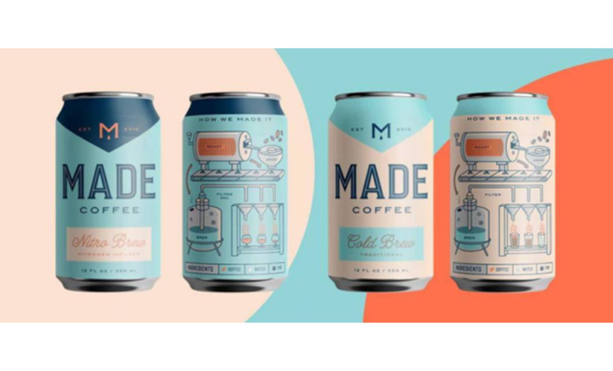
- Distinct pastel color palette
- Attention-grabbing educational infographics
- Modern typography with sleek lines
It’s a pure rarity to see an effective brand package design that answers all questions with such ease and elegance. Everything falls into perfect place, from the typography to the color palette, infographic-like depiction and down to the logo itself — a perfect package.
Black usually dominates coffee branding and package design, so Made Coffee’s lovely, pastel hues of blue and tell a different story and displays a beautiful contrast.
The packaging design features sleek typography that contrasts with the prominent brand name, while the product logo is playful and curvy. The letter "M" and a simple drop of slow-dripped coffee effectively convey the essence of the product.
The logo clearly answers the What question. The illustration both educates people about the process of cold brewing and how it’s done. Icons also show the main ingredients, discovering what kind of taste you can expect inside.
This type of well-put design is a goldmine for customer acquisition and customer loyalty because it’s so engaging. It’s inviting, interesting and grabs your eye. It’s not the type of product you just throw into the shopping cart — once you pick it up, you will spend time studying it and discovering all it has to offer. And that is all thanks to a well-rounded design.


-preview.jpg)
