Team Behind the Design
Most RTDs play it safe, but SixSip breaks the pattern with a bottle built for impact. Agency Squid created a vibrant, modern design system that turns the container into a bold expression of flavor and attitude.
Effective beverage packaging should communicate flavor, mood, and attitude before the consumer even reaches for the bottle.
As I reviewed SixSip, I noticed how every design decision pushes the product into a more imaginative, youthful territory that goes far beyond traditional alcohol cues.
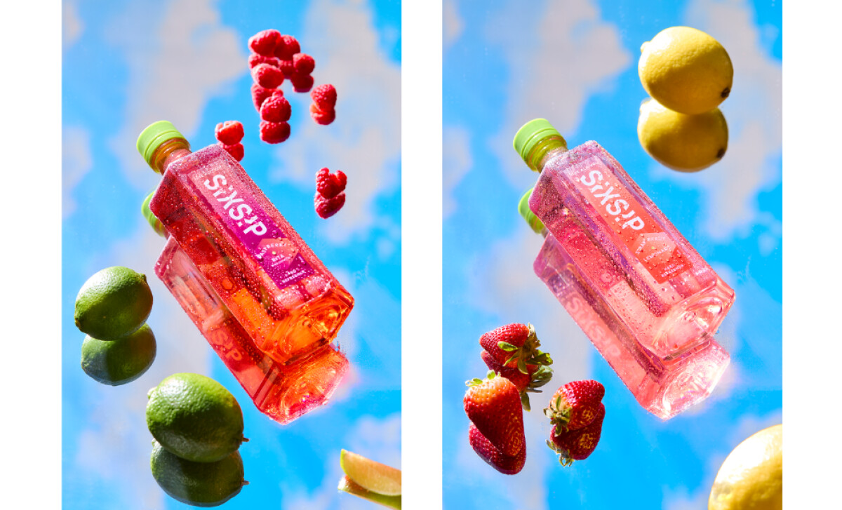
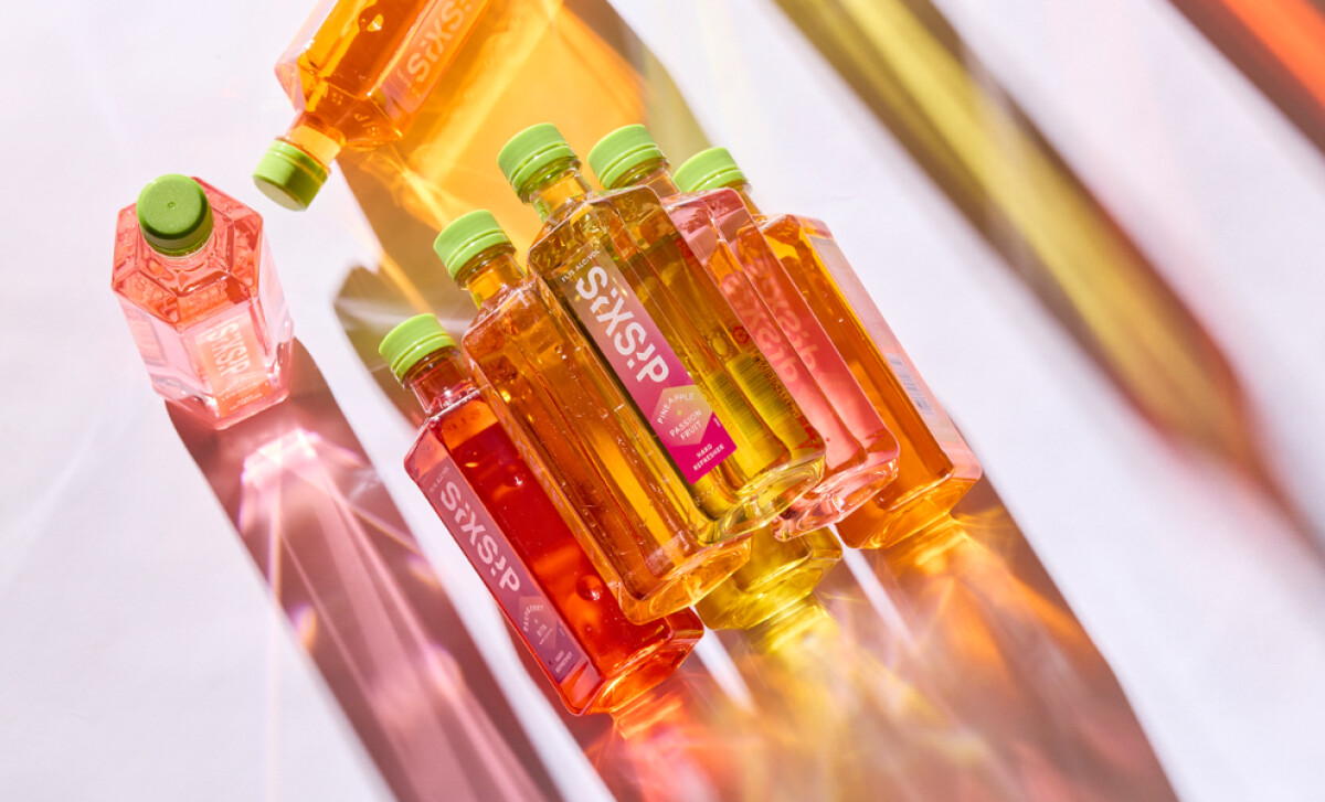
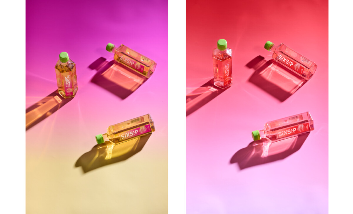
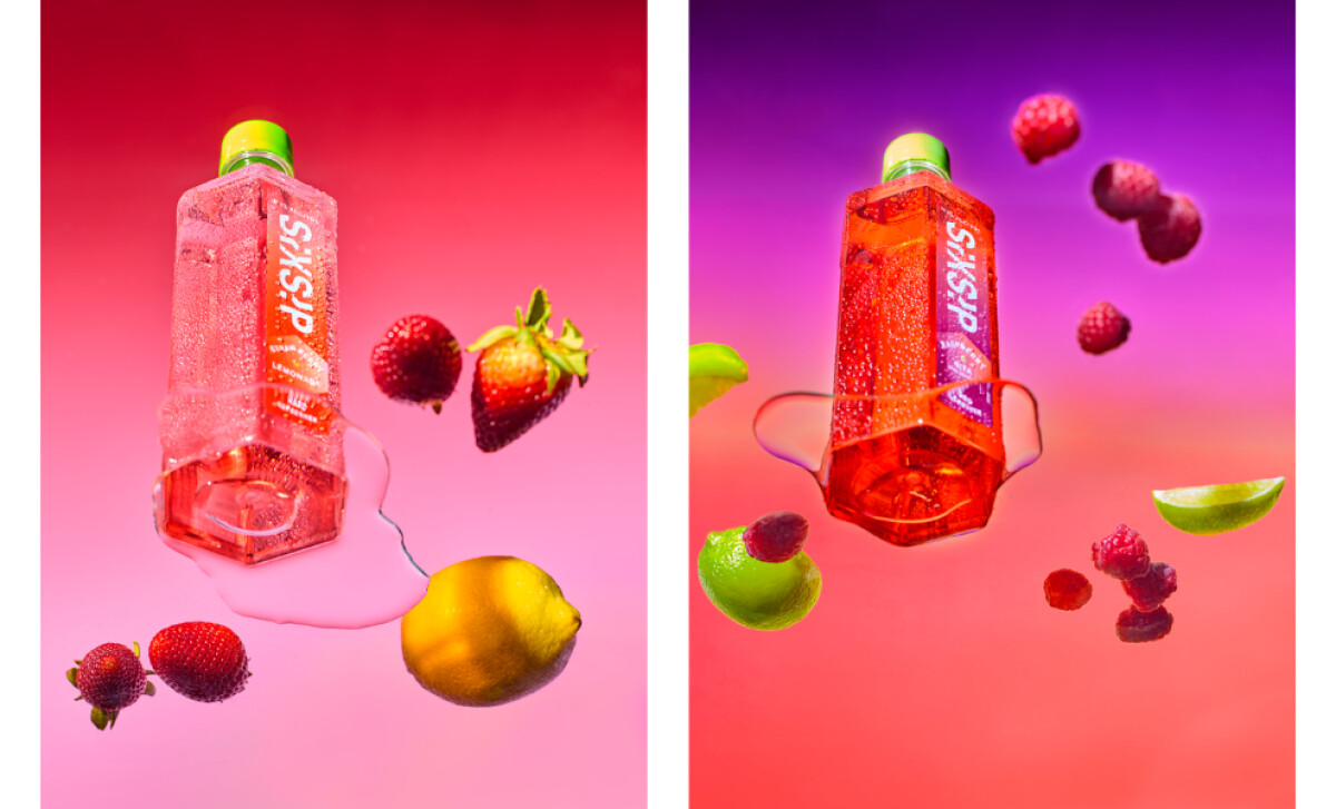
- Bottle Structure and Form: The elongated hexagonal bottle shape breaks away from standard cylindrical formats. Its angled panels create reflections and depth that make the bottle feel sculptural, and I find that this faceted structure reinforces the idea of SixSip being a bold, unconventional choice in the RTD aisle.
- Label System and Information Layout: The vertical label orientation gives the product a clean, modern presence. I noticed how the minimal typography makes flavor names easy to identify while allowing the bottle’s geometric form to take center stage. This creates clarity without sacrificing personality.
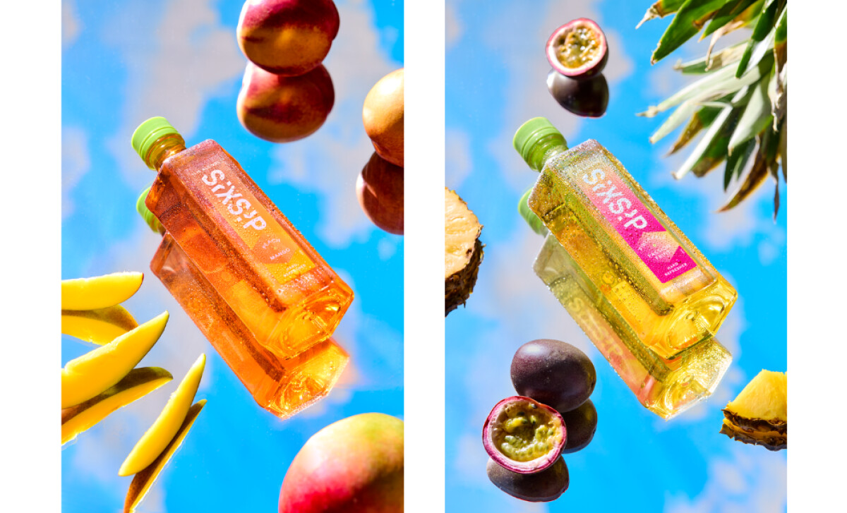
- Color System and Flavor Signaling: The use of vivid, high-energy color coding is one of SixSip’s strongest visual elements. Each flavor is expressed through intense, saturated hues that wrap around the label and refract through the liquid. I find that this color strategy creates instant shelf recognition and makes each variant feel uniquely expressive.
- Material Finishes and Sensory Appeal: The combination of glossy surfaces and crisp label finishes gives the bottle a premium yet playful feel. I appreciate how the transparent body lets the liquid color become part of the design itself, adding vibrancy and depth that support the brand’s surreal flavor universe.
Results
The SixSip launch delivered exceptional commercial performance and quickly outpaced early projections.
- Nearly tripled initial sales expectations
- Secured national placement in Circle K, 7-Eleven, Target, Food Lion, Specs, and more
- Achieved rapid retail adoption across both convenience and grocery channels
- Recognized internally as the most successful brand launch in Phillips Distilling Company’s history
What Brands & Agencies Can Learn from SixSip Hard Refreshers
Agency Squid’s work for SixSip shows how packaging can create its own world instead of blending into an established category. The bottle feels expressive, youthful, and unmistakably bold, which is exactly what the RTD space has been missing.
1. Let Structure Do the Talking
The elongated hexagonal bottle gives SixSip an immediate signature shape. This kind of structural distinction helps a product stand out before a shopper even reads the label.
2. Use Color to Build Flavor Expectation
The vivid, saturated palette assigned to each variant creates instant recognition on shelf. These strong color cues help drinkers sense the personality of each flavor at a glance.
3. Simplify the Label so the Form Can Shine
The vertical label layout supports fast reading while keeping the focus on the bottle’s faceted silhouette. This restraint allows the geometry and liquid color to become central elements of the brand story.
About DesignRush Featured Designs
At DesignRush, we review hundreds of agency projects each month. The featured designs stand out for creativity, relevance, and execution.
Many go on to be recognized as winners of our Monthly Design Awards.
Explore more creative work here:
- Best Packaging Designs
- Best Website Designs
- Best App Designs
- Best Logo Designs
- Best Print Designs
- Best Video Designs
For a full list of design agencies and related services, see our Agency Directory.