Standout Features:
- Lines resembling water movements
- Muted color story
- White, minimalist sleeve
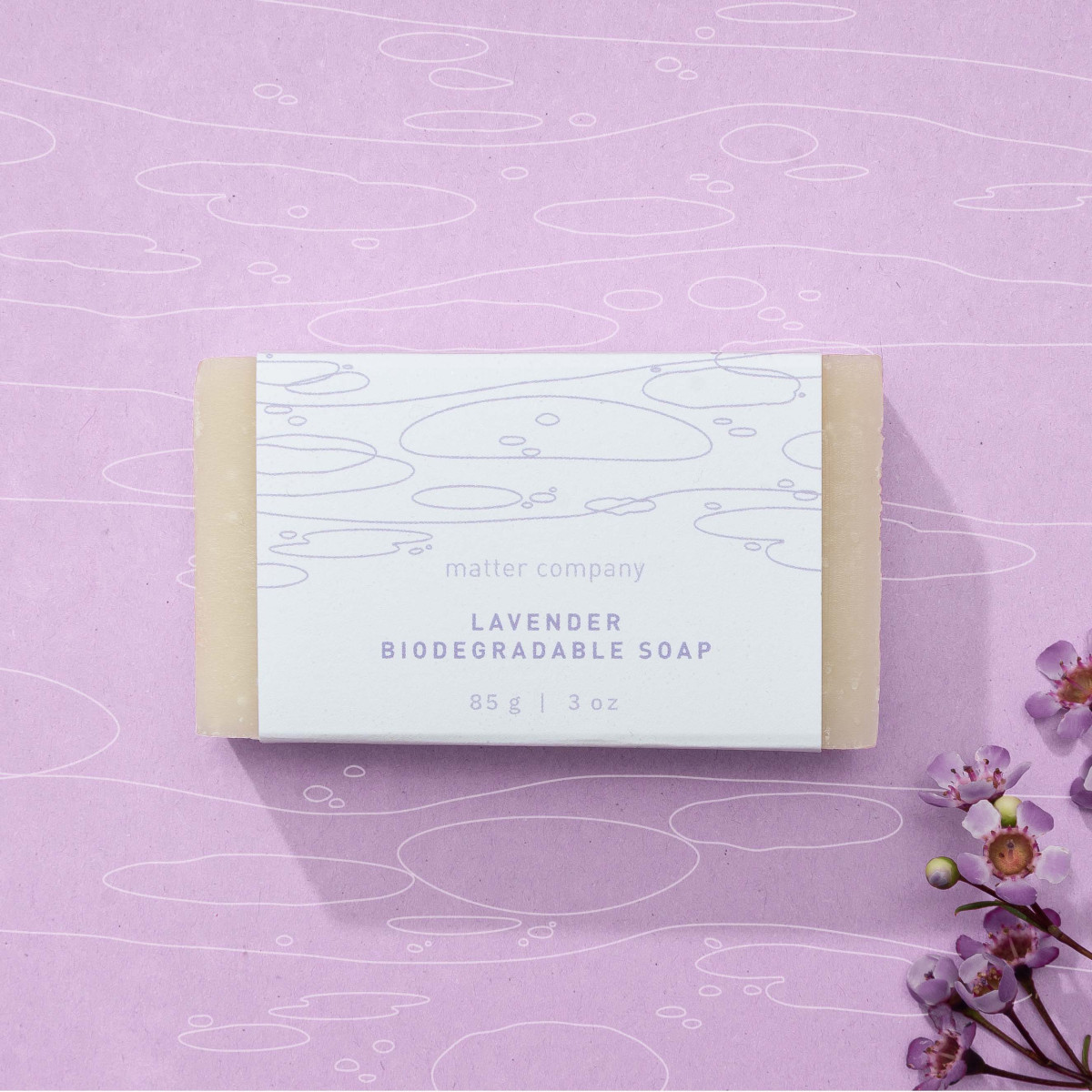
The Ripple Effect's packaging by Night Shift Studio is one of the best soap packaging designs today. The design comes in three variations of white, minimalist sleeves featuring decorative lines resembling different water movements.
These water movements represent the brand's mission to help address the need for clean water throughout Canada.
The packaging design looks clean and straightforward. Each sleeve includes the brand name, product variation in uppercase letters, and the product's weight.
Get a chance to become the next Design Award winner.
SUBMIT YOUR DESIGN
-preview.jpg)

-preview.jpg)
-preview.jpg)