
Standout Features:
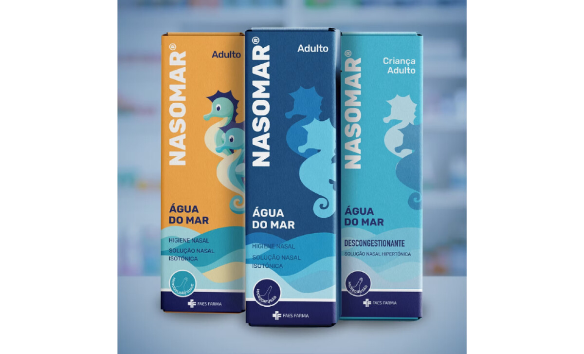
- Evolution of the seahorse and the "Nasomarinho" character
- Consistent wave motif across the packaging
- Modern typography and clean layout
NASOMAR, an established nasal hygiene brand, aimed to modernize its packaging without losing loyal customer recognition. GMA Creative Firm handled the redesign, introducing a fresh look that balances new aesthetics with the brand’s familiar identity by carefully refining elements like the seahorse character and wave motifs.
A key change involved evolving the seahorse character into "Nasomarinho." This stylized update presents a friendlier, more charismatic personality for the brand. Integrated prominently across all products, Nasomarinho helps NASOMAR maintain its unique identity while now appealing more strongly to families shopping for approachable healthcare items.
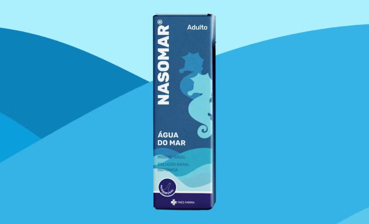
The redesign also makes the familiar wave motif more prominent, flowing continuously across product variations. This visually links the range, reinforcing the product’s connection to its water base. Symbolizing calmness and cleanliness, the unified wave design enhances brand cohesion and provides a sense of trustworthy continuity.
Updated typography features cleaner, more modern sans-serif lettering, making the product name bold and clear. Combined with ample white space, the easy-to-read fonts improve information legibility and access. This streamlined presentation works alongside the wave and seahorse.
Overall, the NASOMAR packaging redesign skillfully modernizes the brand while preserving its core identity. This thoughtful update strengthens NASOMAR's audience connection, boosting approachability and distinction in a competitive health and wellness market.


-preview.jpg)