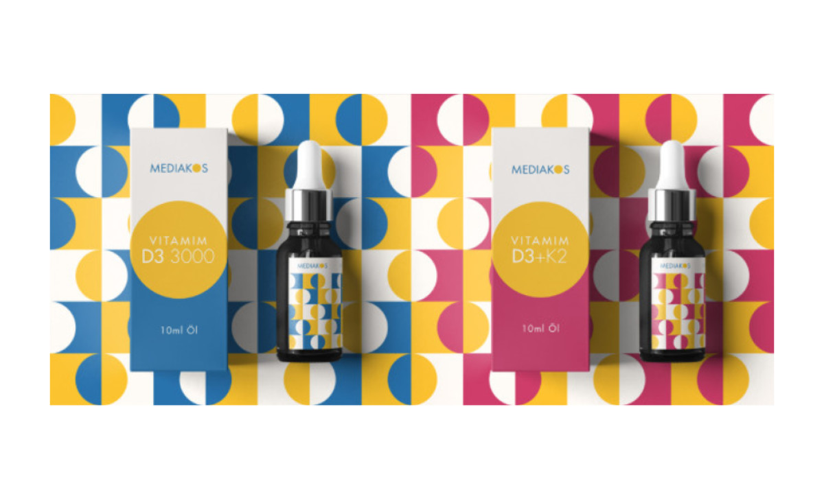
Standout Features:
- Leveraging simple geometry
- Abstract patterns
- A clever combination of warm and cool colors
MEDIAKOS is a brand that provides entry of innovative products into the highly competitive pharmaceutical distribution market across Germany. The brand’s success is due to visually appealing designs that help MEDIAKOS’ products stand out on the shelves. Check out our article on the best pharmaceutical packaging designs.
Daniel Soto helped the brand by designing a modern box packaging design. Abstract yet simple and comprehensive, the layout relies on basic geometry and prompts various interpretations for the viewer. Through the clever combination of warm and cool colors, the packaging design grants a unique artistic atmosphere to the customer.
Soto took the “Sun” from the brand’s logo and used it as a base for the mosaic-like patterns inspired by Greek art, once again staying in touch with the brand’s name (etymology) and its visual identity.