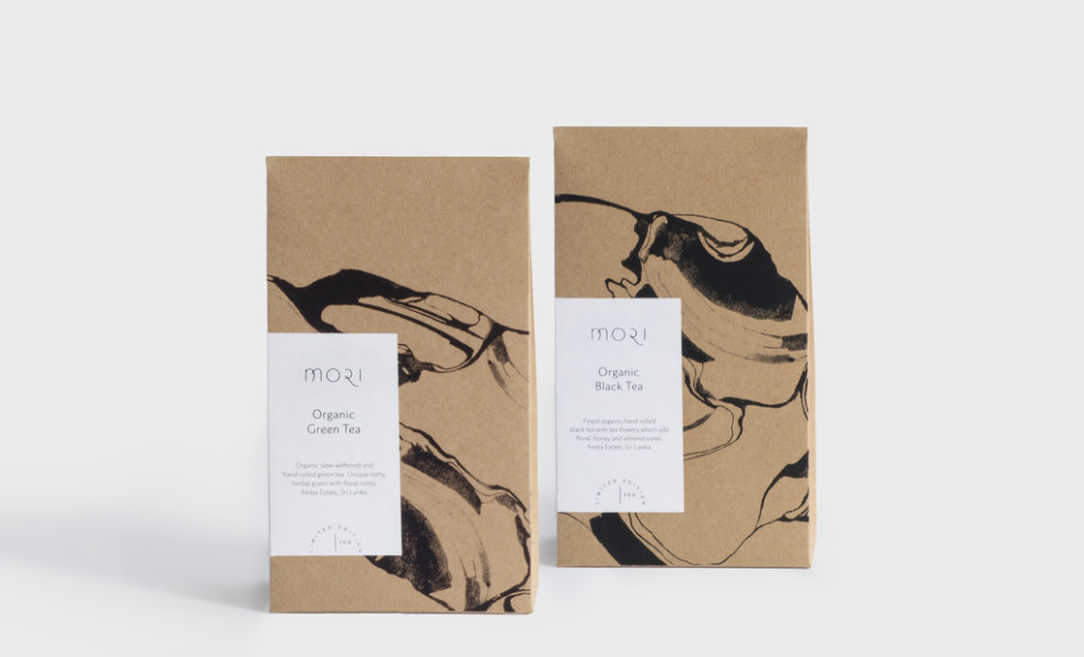
Standout Features:
- Brown kraft paper packaging
- Muted neutral shades
- Minimalist abstract depiction
Alessandra Fasino's packaging work for Mori Organic Tea masterfully captures the brand's core values of quality, craftsmanship, and timelessness based on Japanese wabi-sabi design principles.
Using brown kraft paper aligns perfectly with Mori's commitment to natural materials and sustainable practices. This choice adds a touch of rustic charm and speaks to the brand's dedication to environmental consciousness.
The color palette embraces muted neutral shades, in line with the wabi-sabi aesthetic's appreciation for understated beauty and natural imperfections. These earthy tones create a sense of tranquility and harmony, enhancing the overall sensory experience of enjoying a cup of mori tea.
Overall, the abstract design succeeds in creating visual interest without being too exuberant, making for a complete minimalist package with the unique depiction of tea plantations, mountains, and flowing shapes.


-preview.jpg)