
Team Behind the Design
Designer: Logan VoigtCient: Nurture & RenewCategory: Packaging Design (Health & Wellness)Location: North Carolina, United States
Project Brief: Create a soothing packaging system designed to communicate renewal, accessibility, and quiet luxury.
Packaging Design Analysis
What I love about Nurture & Renew's packaging is how it instantly communicates a sense of ease. It feels intentional, modern, and deeply aligned with the spa’s promise of renewal.
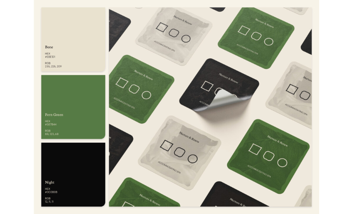
Color & Tone
I appreciate how the palette blends soft neutrals with earthy greens to create a grounded sense of calm. The colors feel natural and restorative, reinforcing the spa’s wellness-driven experience.
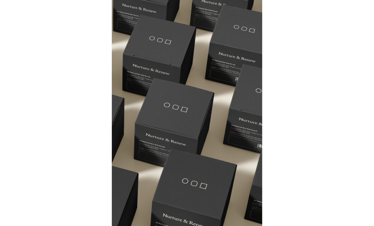
Typography & Mark System
The serif logotype paired with geometric symbols feels balanced and quietly elegant. It communicates clarity while still offering a touch of refinement.
Packaging Structure & Materials
I like how the matte black boxes create a premium look without overwhelming the product. The window reveal adds transparency and trust, making the unboxing feel intentional.
User Experience & Brand Expression
The repeated icon system builds a gentle rhythm that makes the brand feel cohesive and memorable. It creates visual consistency while reinforcing the sense of calm the spa is known for.
What Brands & Agencies Can Learn from Nurture & Renew
Nurture & Renew’s packaging shows how wellness brands can express calm and quality through subtle, intentional choices rather than loud visual cues.
1. Let Color Set the Emotional Foundation
Soft neutrals paired with earthy greens create an atmosphere of comfort and confidence. This approach proves that a grounded palette can communicate wellness more effectively than overly bright or clinical tones.
2. Use Symbolic Systems to Build Recognition
The combination of a refined serif logotype with simple geometric icons creates a visual rhythm that feels both organized and soothing. Symbols used consistently across packaging can reinforce identity without relying on heavy branding.
3. Design Packaging That Communicates Trust at a Glance
Matte textures, clean structures, and a considered product window help the experience feel honest and premium. These small details show how good packaging can provide reassurance before a customer even touches the product.
About DesignRush Featured Designs
At DesignRush, we review hundreds of agency projects each month. The featured designs stand out for creativity, relevance, and execution.
Many go on to be recognized as winners of our Monthly Design Awards.
Explore more creative work here:
- Best Packaging Designs
- Best Website Designs
- Best App Designs
- Best Logo Designs
- Best Print Designs
- Best Video Designs
For a full list of design agencies and related services, see our Agency Directory.


