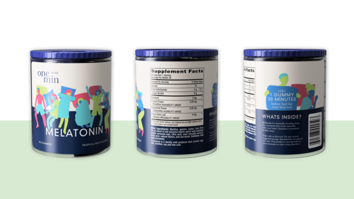
Standout Features:
- Dosage-representative package
- Multicolored design
- Diverse 2D illustrations
Emmanuelle Kronenberg created a delightful packaging for one more min, connecting with a younger audience while emphasizing the importance of taking supplements on time.
The clever design dispenses one gummy at a time, encouraging consumers to stick to the recommended dosage. Thanks to its easy-to-use and refillable structure, the container offers a friendly nudge to keep up with supplements!
Departing from the typical overwhelming use of purple in most melatonin products, one more min opts for a pastel color palette ranging from soft orange to light navy. These refreshing hues resonate with younger consumers and radiate calmness, aligning with restful sleep promotion.
Lastly, charming illustrations adorn the design, featuring characters lying in various sleeping positions. These diverse figures highlight that sleep issues vary from person to person, reinforcing the company's commitment to inclusivity.


