Team Behind the Design
Packaging Design Analysis
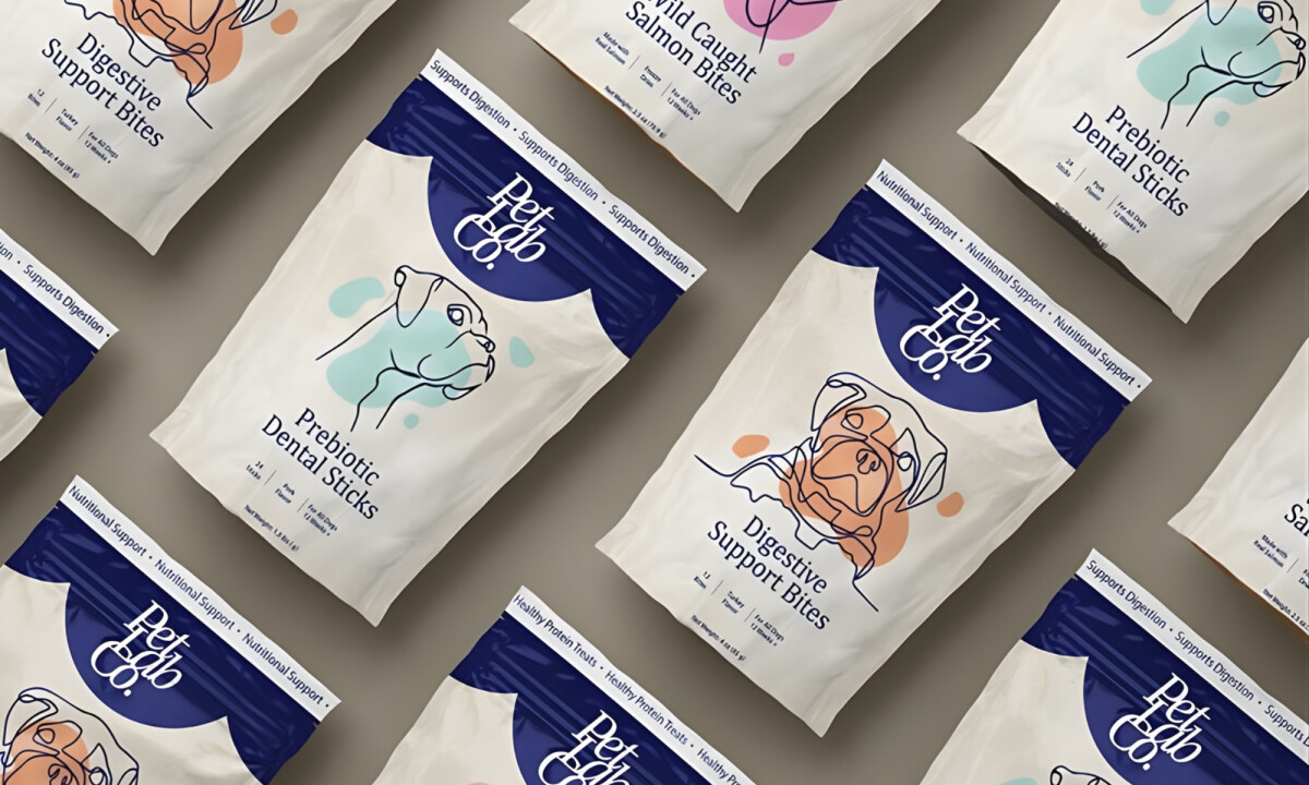
Illustration, hierarchy, color.
These are the retail packaging design elements that build trust at shelf level.
PetLab Co.’s redesign shows a strong understanding of how friendly visual language can coexist with nutritional credibility.
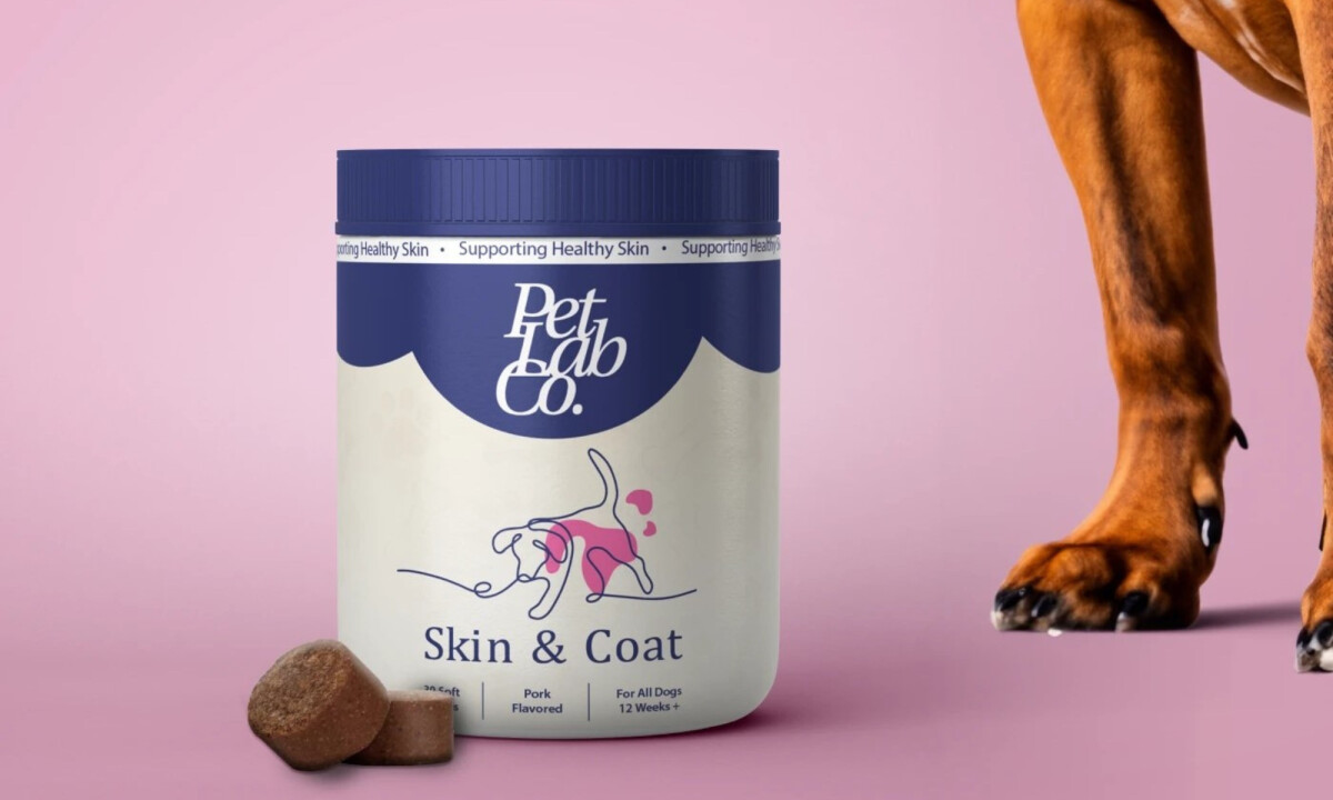
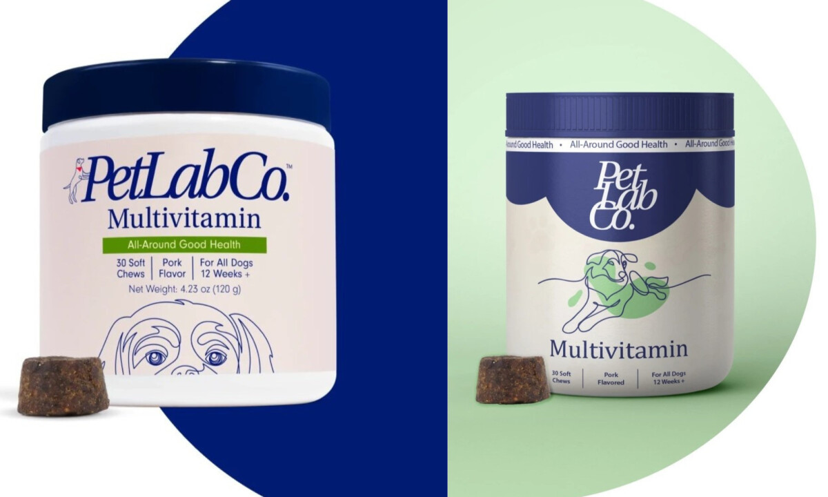
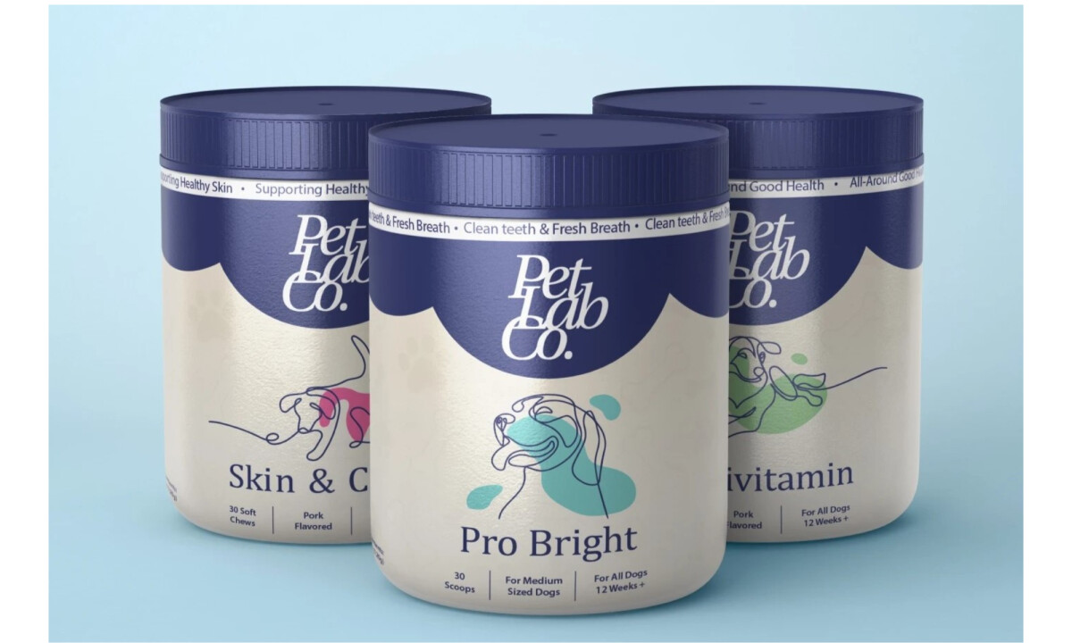
- Illustration-Led Communication: I appreciate how the line-drawn dog illustrations humanize the products without turning them into novelty items. The expressive outlines paired with soft color accents clearly signal function while keeping the brand approachable and emotionally engaging.
- Color System & Product Differentiation: The restrained palette anchored by deep blue creates consistency, while accent colors help distinguish each supplement type. I find this balance effective in making the range easy to scan without fragmenting the brand across SKUs.
- Typography & Information Hierarchy: The typography prioritizes product names and benefits, supported by clean spacing and minimal copy. I see a clear effort to reduce cognitive load, making dosage and purpose easy to understand at a glance.
- Scalability & Shelf Presence: The packaging system translates smoothly across jars, pouches, and multiple supplement categories. From a reviewer’s standpoint, this consistency strengthens shelf impact and positions PetLab Co. as a cohesive, reliable brand rather than a collection of individual products.
Collaborator Input
This perspective from the designer highlights how the refreshed packaging builds directly on PetLab Co.’s existing brand DNA while pushing it into a more distinctive and unified system.
Word from the Agency
"I always thought the identity of this company was fun and different, so I wanted to challenge myself by using ideas from the original packaging, and making the system stand out even more: keep current brand image by using illustration line work of dogs with a pop of color."
— Made by Dakota
What Brands & Designers Can Learn from PetLab Co.
1. Use Illustration to Build Emotional Trust
Friendly, well-crafted illustrations make the products feel caring and approachable without undermining credibility. This balance helps pet owners connect emotionally while still trusting the science behind the supplements.
2. Create a Clear, Scannable Color System
A consistent base color paired with distinct accents makes the product range easy to navigate at shelf level. Strong color logic improves recognition while supporting future line extensions.
3. Prioritize Clarity Over Complexity
Clear typography and focused information hierarchy reduce confusion and decision fatigue. Packaging is most effective when benefits and usage are understood instantly.
About DesignRush Featured Designs
At DesignRush, we review hundreds of agency projects each month. The featured designs stand out for creativity, relevance, and execution.
Many go on to be recognized as winners of our Monthly Design Awards.
Explore more creative work here:
- Best Packaging Designs
- Best Website Designs
- Best App Designs
- Best Logo Designs
- Best Print Designs
- Best Video Designs
For a full list of design agencies and related services, see our Agency Directory.