Standout features:
- Easy-to-use container
- Simple messaging
- Eye-catching design
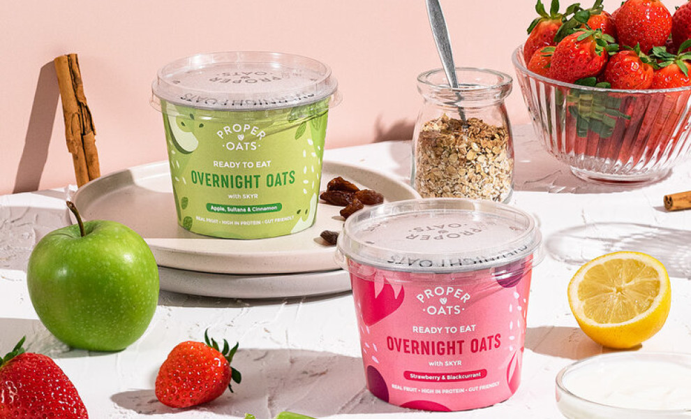
Proper Oats is a popular brand of ready-to-eat oatmeal from the UK whose market rise was facilitated by the endorsement of entrepreneur Deborah Meaden and its appearance on the BBC’s The One Show. Its package design is a creation of Brash Creative agency.
They set out to create an “eye-catching packaging that provides ample amounts of shelf standout” to compete in the brand’s saturated space and yet reflects the product accurately. They also aimed to educate the consumers on the concept of overnight oats and communicate the fun and healthy flavors through the choice of colors.
The result is a very contemporary-looking design with instantly recognizable flavor profiles and a “ready to eat” message highlighted on the packaging. The messaging rejects the scientific jargon, making the entire concept universally comprehensible to a wider audience.
Each flavor features its own signature over the packcolor allaging, with little to no white surfaces that would break the wholeness of the solid color palette. Different, darker shades of each color – pink for raspberry and green for apples – are featured on the wording and other visual elements for legibility.
-preview.jpg)