Games are what provide us with an escape to fun. Some of the best games are board games. Who doesn’t remember the crazy family and friend matches in Monopoly that may have resulted in someone flipping the board after they go bankrupt, sending Park Place cards and hotel pieces across the room like toy shrapnel.
Pyramid Arcade is a collection of bite-sized thematic games. The most memorable part of games are not just the fun and competition, they are the package designs themselves. Pictionary, Monopoly, Operation, Clue, the list goes on with iconic packaging design seared into our memories that will last forever. That is what makes great games stand out from others on the shelves.
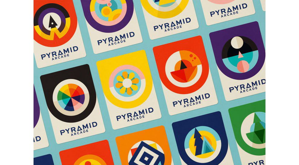
Designers Eileen Tjan and Abe Zieleniec were tasked with creating a packaging design and identity system that could be used across multiple games within the Pyramid “arcade,” to provide each game with its own unique appearance and voice. The key here was to remain consistent across the entire package.

The best packaging designs execute a central theme. The central theme here revolves around geometric iconography. Individual game logos use this geometric template which results in a beautiful display of color that is aesthetically pleasing to the eye and unique at the same time.
This booklet features a red background and multiple arched doors in yellow, green, pink, and red. This is a Christmas-themed game. It is colorful and eye catching.

Here we can see the individual geometric elements instilled in each of the game pieces. From the pinwheel spun triangle to the flower wheels (or even the square grid markers), everything fits perfect and compliments one another. The same colors are seen throughout each unique game piece. In best package design, consistency is key.

Look how unique and creative these geometric board pieces are. Each colored square has a contrasted array of mini triangles that burst with attention. The individual Christmas tree pieces stack onto each other like a triple decker BLT sandwich. This is extremely pleasant to look at.

A closer view shows the astonishing level of detail that went into this example of best package design. This is stunning. Each purple triangle tree has individual triangle trees on each one. The dye, also has the triangle shapes with mini dots. It looks so creative and fun I want to pick up the dice myself and dive in to competitive board game war.
Pyramid Arcade Branding is a colorful packaging design in the Arts & Recreation industry.
-preview.jpg)