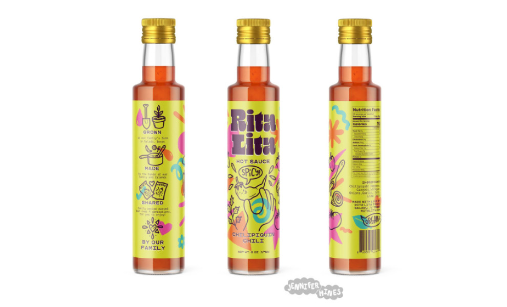
Standout Features:
- Vibrant colors
- Slim bottle packaging
- Hand-drawn geometric shapes
Jennifer Hines designed the packaging for Rita Lita Hot Sauce, a fiery fusion of flavor and visual flair. The packaging exudes a playful impression that captures the essence of the brand.
The bottle's gleaming gold metal cap crowns it, adding a sophisticated touch to the design and hinting at the premium quality of the hot sauce within.
The slim bottle packaging is a standout, paired with the vibrant colors of the label and a transparent section where consumers can peek into the product inside. This also highlights the product's enticing color and creates an air of anticipation for its taste.
Finally, playful label illustrations and hand-drawn geometric shapes add a whimsical touch to the packaging design. The hand-drawn elements add personality and warmth and complement the structured printed text to create visually balanced and engaging packaging.


