Standout Features:
- Fun fruit illustrations
- Rounded edged typography
- Fun and playful designs
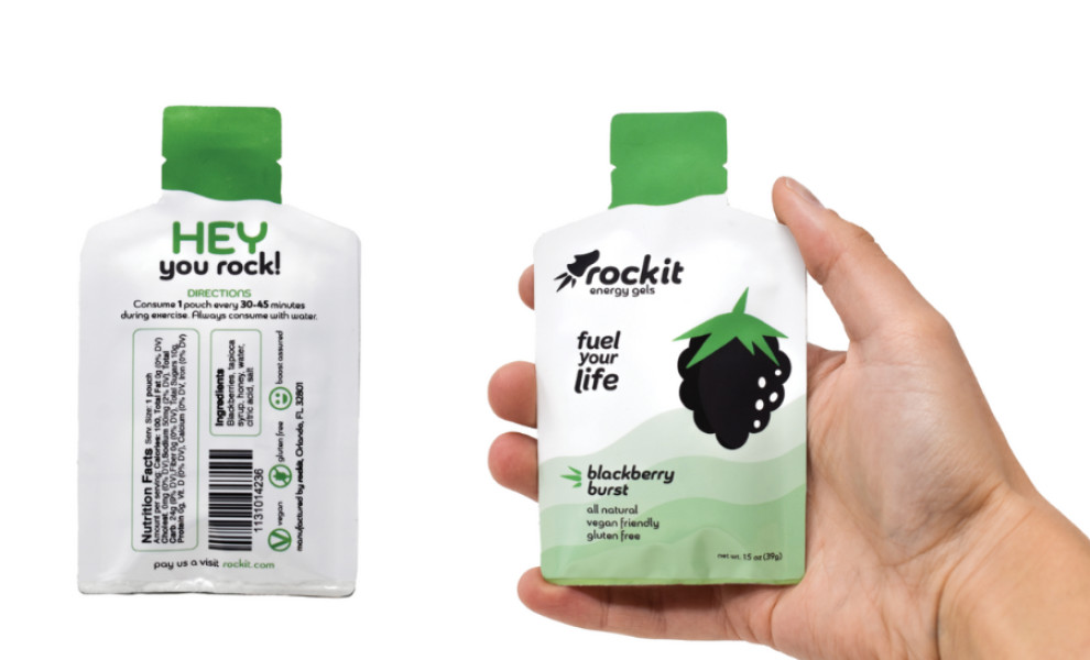
Rockit's packaging design, crafted by Emma Wazny Design, is a playful and inviting celebration of healthy living. The packaging is adorned with whimsical illustrations of fruits, adding a touch of personality and charm while highlighting the product's fresh, natural ingredients.
The typography's rounded edges evoke playfulness and approachability, complementing the fun fruit illustrations and creating a cohesive and inviting visual identity.
The overall design is characterized by its playful nature. It uses bright colors, bold patterns, and quirky illustrations to capture attention and create a positive association with the brand. This approach appeals to consumers who value healthy living and appreciate a lighthearted and joyful approach to food.
-preview.jpg)