Standout features:
- Lush imagery and colors
- Flavor-dependent details
- Well-incorporated logo
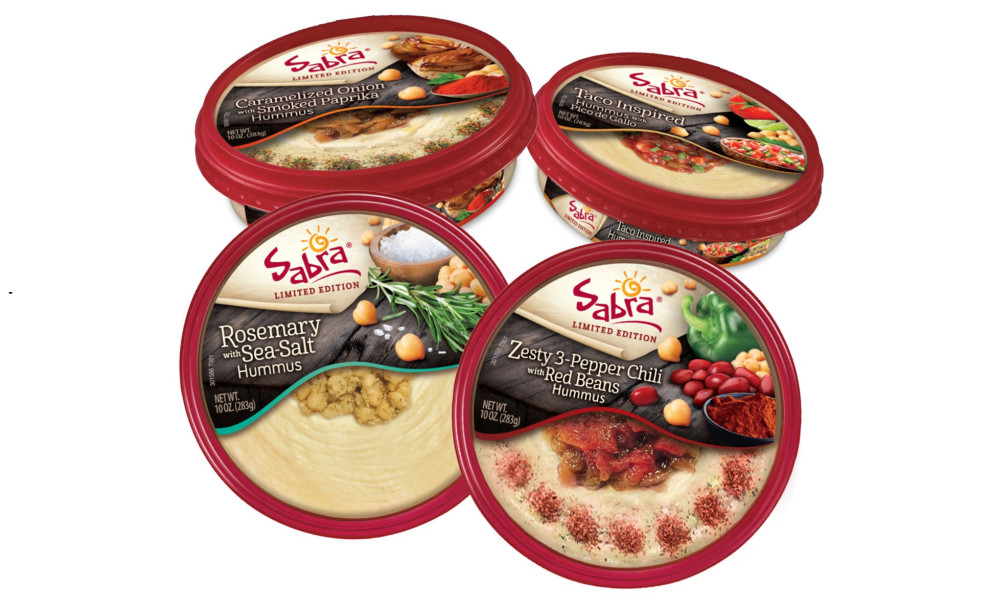
The S2 Design Group's package design for Sabra's brand of hummus revolves around the limited-edition flavors that "blend familiarity and novelty."
The four distinct flavors of this chickpea-based spread hailing from the Middle East all come with their respective lush packaging. Quite contrary to the minimalistic tendencies in contemporary package design, these retail store boxes go for a more maximalist approach.
Sabra's logo is located at the top half of the packaging, with its playful font and a Sun illustration that both introduce a laid-back, friendly feel to the product. The flavor description and pictures of ingredients against a table background occupy the middle part while the bottom half displays the actual hummus at its most succulent.
The red frame of the packaging's lid gives it another unique trait that makes it both stand out while complementing the rest of the visual elements and colors. The packaging itself is sufficiently deep (or tall) to repeat some of the crucial elements from the lid, such as the name of the flavor and its imagery.

-preview.jpg)

