Standout Features:
- Black bottle
- Red accent color
- Easy-grip bottles
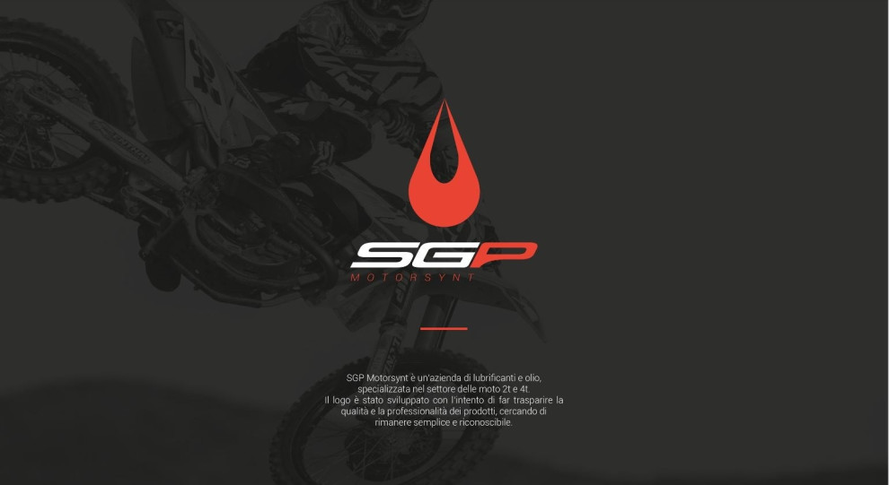
Simone Liberati's design for SGP Motorsynt merges form and function. The minimal and sleek black bottle signifies the product's suitability for demanding conditions, while the droplet-like logo and red accent color aid in brand recognition.
As part of the branding, the droplet motif communicates energy and power, desirable qualities in motor oil products. This consistent visual element helps position the product as a high-performance choice.
The easy-grip feature shows attention to user experience, ensuring practicality is at the forefront of the packaging design. This feature is especially beneficial during product usage, such as automotive maintenance.
Get a chance to become the next Design Award winner.
SUBMIT YOUR DESIGN