Standout Features:
- Diagonal duotone color scheme
- Bold, vertical typography
- Custom "doodle" illustrations
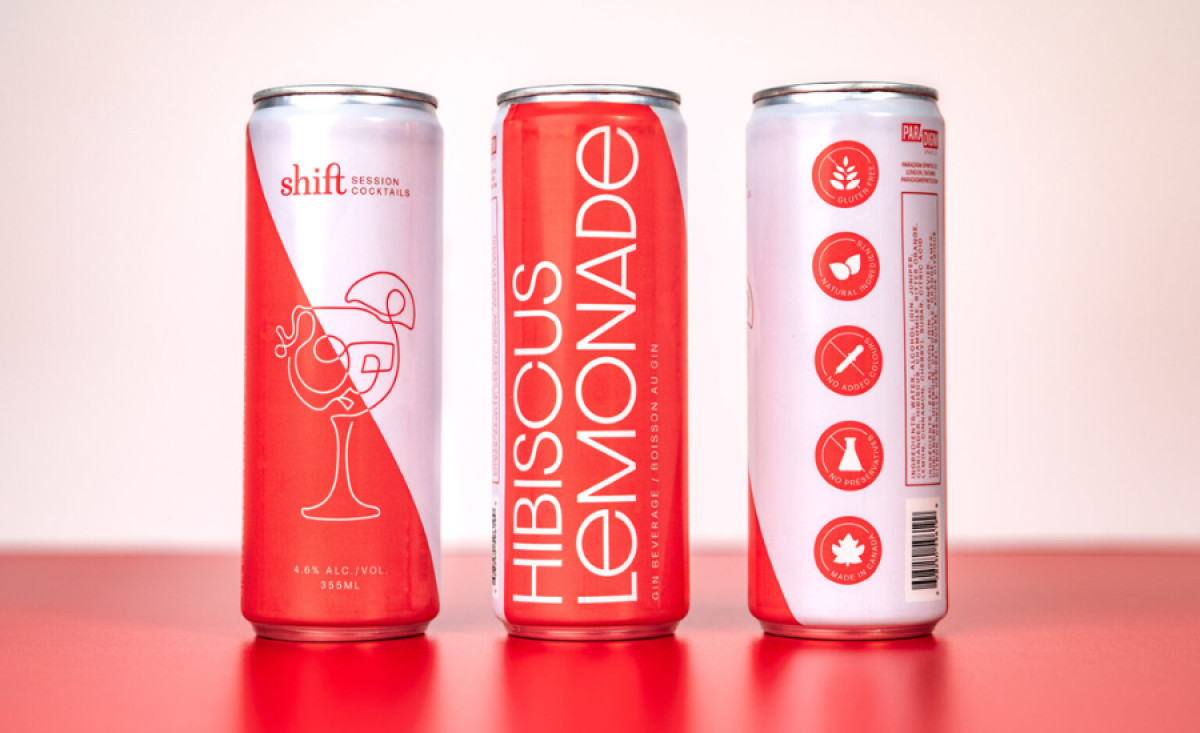
Kim Love Designs took on the challenge of creating the visual identity for Shift Session Cocktails, a new line of ready-to-drink (RTD) cocktails by Paradigm Spirits Co. The brand needed to convey a "premium, simple, craft" ethos while reflecting a paradigm shift in the cocktail market.
One of the most striking features of the packaging design is the diagonal duotone color scheme. The two-tone background adds a sense of movement, aligning with the “shift” concept. This visual cue immediately catches the eye. It also creates a sense of premium quality, reinforcing the product’s positioning as both crafted and accessible.
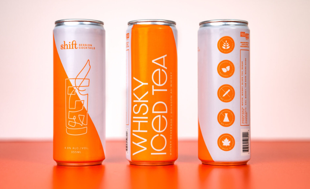
Typography is another standout element, especially the bold, vertical type used to showcase the flavor names like “Hibiscus Lemonade” and “Whisky Iced Tea.” The custom “art deco” font contrasts beautifully with the clean lines of the label, adding a touch of elegance while remaining modern and simple.
Each can also feature a custom “doodle” illustration, which serves as visual shorthand for the drink’s specific flavor. This simplistic yet sophisticated illustration reinforces the minimalism of the design while offering an easy way for consumers to quickly identify their drink of choice.
In conclusion, the packaging successfully merges sophistication with simplicity, delivering a visual identity that stands out in the competitive RTD market. With its striking duotone colors, bold typography, and custom illustrations, it’s an excellent example of the best food and beverage packaging design, perfect for a modern, premium cocktail brand.


