Standout Features:
- Bold, consistent color palette
- Interactive, whimsical illustrations
- Clean, cohesive typography
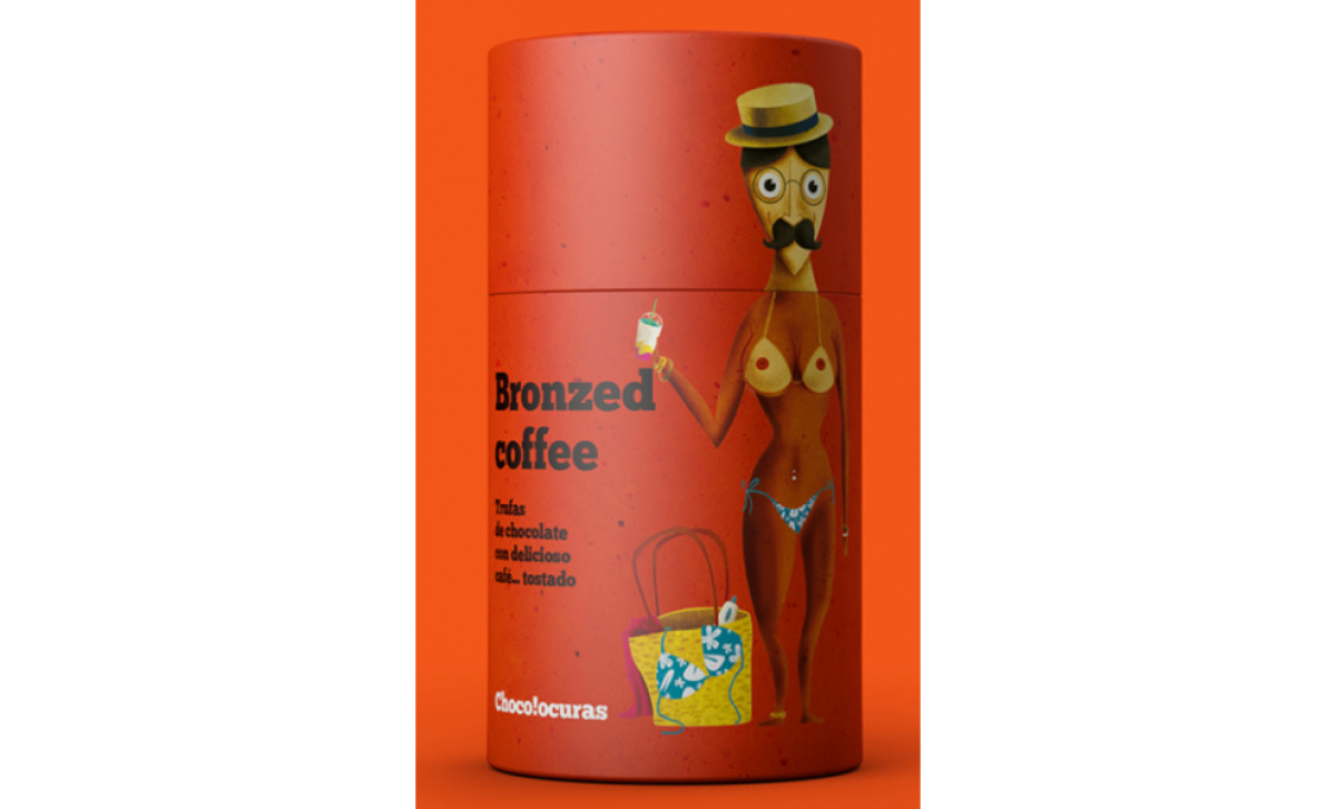
By embodying coffee blends with funny heroes, laid onto the colorful matte background, the Supperstudio design agency made sure the Chocolocuras Coffee packaging would pop out on any shelf.
Right from the start, the bold, consistent color palette grabs your attention. Brash and vibrant hues, including a striking highlighter yellow adhere strictly to brand standards. This consistency reinforces the brand identity and sets the product apart in a sea of competing packages.
Like some of the high-end packaging design agencies, the Supperstudio takes a playful turn with whimsical illustrations. Oval packaging has two parts, the body of the main character, and the lid has drawn various heads on it, so you can, for example, change Mr. Sailor into a bikini-wearing woman in no time. This creative approach transforms a simple coffee package into a conversation starter, drawing customers in with its unique charm.
Complementing these elements is the clean, cohesive typography. Eschewing cluttered, crammed fonts, this food and beverage branding offers clear and sophisticated text that informs without overwhelming.