Standout Features:
- Distinctive artist-commissioned labels
- Loud colors and varied fonts
- Visual themes of tattoo art and regional culture
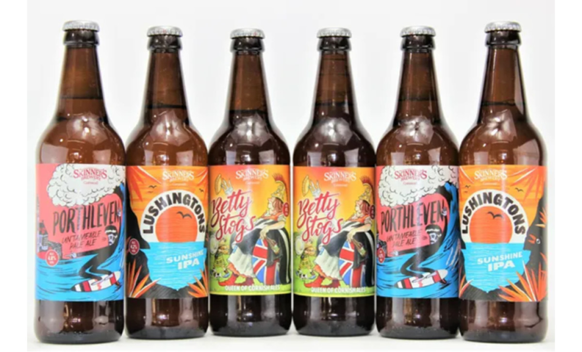
UK-based brewery Skinner’s doesn’t just craft distinctive ales — it curates a gallery of design. With eight signature brews, each label is a commissioned piece, crafted by local artists, and steeped in distinct visual language. Some nod to old-school publishing and newspaper aesthetics, others pull straight from tattoo culture.
Yet, despite the variety, there’s a thread of cohesion — the brand’s signature approach to bold storytelling, unafraid to mix styles but always anchored in authenticity. Each label may have a different voice, but together, they sing the same drinking song.
Then there’s the sheer volume of the visuals. Loud colors, in-your-face typography, and clashing yet strangely harmonious fonts create a shelf presence that demands to be noticed.
There’s no subdued elegance here, no effort to blend into the craft beer minimalism trend. Skinner’s leans into the chaos, stacking typefaces and cranking up the saturation. Skinner’s beer packaging are loud, chaotic, and absolutely unmissable. High-contrast colors, striking typography, and intricate illustrations crash together to create something that’s impossible to ignore. Whether stacked side by side in a lineup or sitting solo on a bar counter, these labels don’t just stand out. They take over.
-preview.jpg)

-preview.jpg)