Standout Features:
- Bold typography and minimalist branding
- Black and white color palette
- Product-specific imagery and clear labeling
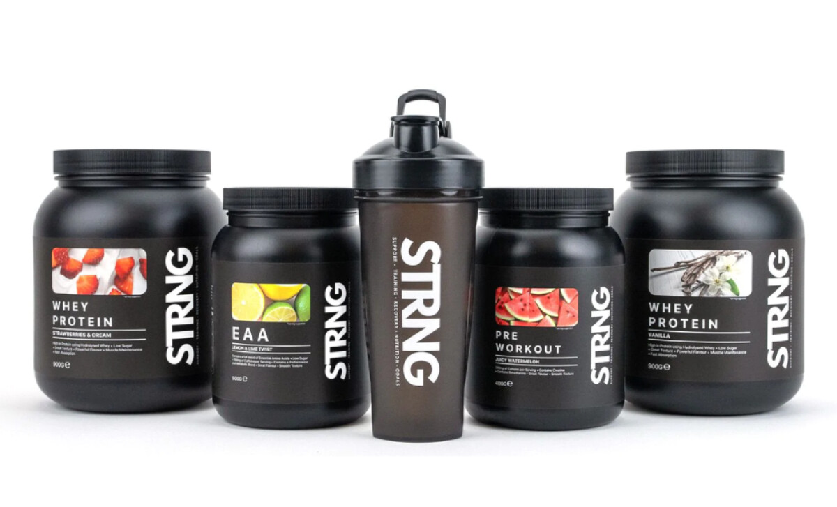
STRNG Supplements provides nutritional products designed to fuel training, recovery, and overall fitness for health-conscious individuals. Its packaging, created by Maya Karampalasi, uses a modern, minimalist aesthetic to reflect the brand's core values of quality and high performance in every container.
The design relies on bold typography and minimalistic branding, with the name "STRNG" featured prominently in a large, simple sans-serif font on each label. This bold approach effectively reinforces the strength and performance focus of the supplements, contrasting sharply against the matte black background.
The sleek black and white palette dominates the packaging. Black serves as the primary background, allowing the white typography and accents to provide strong contrast. This timeless combination positions STRNG as a premium, high-performing choice in the health and wellness category while ensuring excellent readability.
Each product features specific imagery and clear labeling, such as vibrant strawberries for whey protein or juicy watermelon for pre-workout. This allows consumers to easily identify flavors and supplement types while enhancing sensory appeal. This functional approach ensures the packaging communicates essential information clearly.
Maya Karampalasi's design for STRNG Supplements powerfully fuels the brand's performance-oriented message through its strong, clean aesthetic. It shows other health and wellness brands how minimalist packaging design can effectively communicate quality and focus.