


- Agency: Bulletproof
- Client: Tecate
- Category: Packaging Design — Beer
- Location: London, United Kingdom
- Project Brief: Create packaging design that reconnects Tecate with its Mexican heritage through a revived ingot symbol, dynamic eagle, and contemporary brand system.
Beer packaging carries a lot of heritage on a small aluminum canvas. Tecate, the Mexican lager rebuilt by Bulletproof, hangs its whole refresh on one redrawn eagle and a T ingot cut into its chest.
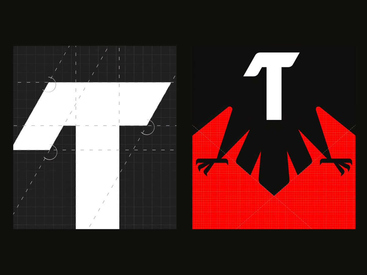
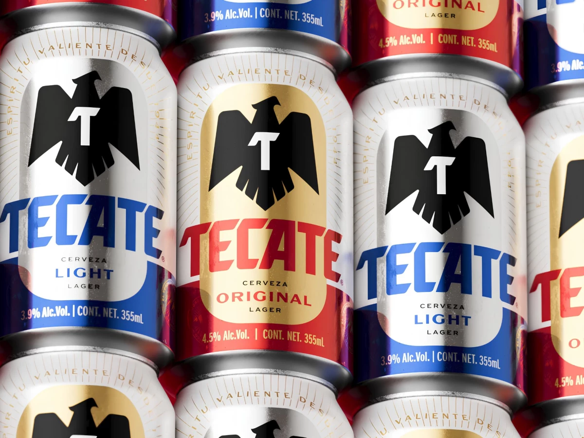
The eagle is the centerpiece, redrawn bolder and more upright with sharp talons and clean negative space. A white T sits where the ingot symbol was pulled from the archive, so the letter reads as both monogram and badge without a separate mark.
The color split does the range work, banding a silver top half over a solid base that flips red for Original and blue for Light. Sunburst line rays behind the bird push the eye to the center, giving a mass-market lager a confident, almost heraldic front.
The construction is tight, built on a grid that keeps the eagle symmetrical and the wordmark's angled cuts sharp. The catch is distinctiveness, since a black eagle over red and silver is well-worn beer territory, and the can leans on execution rather than a genuinely new idea to stand out.