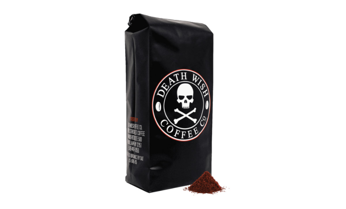
Standout Features:
- Prominent logo placement
- Sophisticated black background
- Legible, sans-serif typography
Death Wish Coffee’s packaging design is a bold visual manifesto that perfectly mirrors its promise of an ultra-strong brew. The prominent logo placement — featuring the iconic skull and crossbones — immediately captures attention and speaks to the brand’s rebellious spirit.
The design’s sophisticated flat black background adds another layer of intrigue. With its deep, inky tone reminiscent of a pirate flag, the backdrop exudes mystery and adventure while reinforcing the coffee’s dark, potent character.
Complementing these striking elements is the use of legible, sans-serif typography. This modern typeface provides a crisp contrast to the classic serif style of the logo, ensuring that essential information is easy to read and adding a contemporary touch to the overall design. Together, these design features create a package that is as daring and powerful as the coffee it contains — a true celebration of strength, defiance, and quality.

-preview.jpg)