-desktop.jpg)
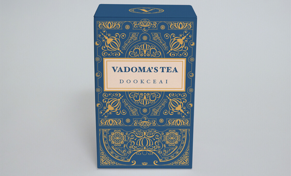
With a concept inspired by fortune-tellers, the packaging for Vadoma's Tea is a journey into a mystical world. Designer Christopher Klaich uses ornate, 17th-century aesthetics to craft a unique brand identity. The resulting design makes each tea box feel like a carefully crafted talisman — one part potion, one part product.
Industry Insight: The global tea packaging market was valued at USD 6.3 billion in 2024 and is projected to grow, driven by the rising "premiumization" of tea products.
Let's break down how Vadoma's Tea masterfully taps into this trend by positioning its product not just as a beverage, but as a luxurious experience.
Key Findings for Brands:
- Specialty printing techniques like foil stamping can elevate packaging to a luxurious, tactile experience.
- Thematic color-coding not only aids in product differentiation but also deepens brand storytelling.
- A consistent design system across product variants builds strong brand recognition and contributes to growth.
Foil-Stamped Scrollwork Evokes Arcane Splendor
The defining element that makes this one of the best packaging designs is its lush, symmetrical scrollwork — stamped in metallic gold foil across every panel.
This ornamental pattern, with its symmetrical layout and botanical details, feels inspired by tarot decks and ancient books.
It's a powerful use of symmetry and asymmetry in design to create a sense of balance and order.
This is how you turn a simple container into a story. The detailed pattern gives the box a sense of ancient magic, as if it holds something more than just tea.
Plus, the gold foil is a luxurious touch that catches the light beautifully. It makes the entire package feel like a gilded object from another time.
For 72% of American consumers, a product's packaging design significantly influences their purchase decisions. What the customer sees here is a product that promises a unique and luxurious experience.
The design is a bold move away from the minimalist trend in packaging. It’s one of those unique product packaging design ideas that gives it a huge advantage on the shelf.
The Packaging Design Features Gemstone-Inspired Color Coding
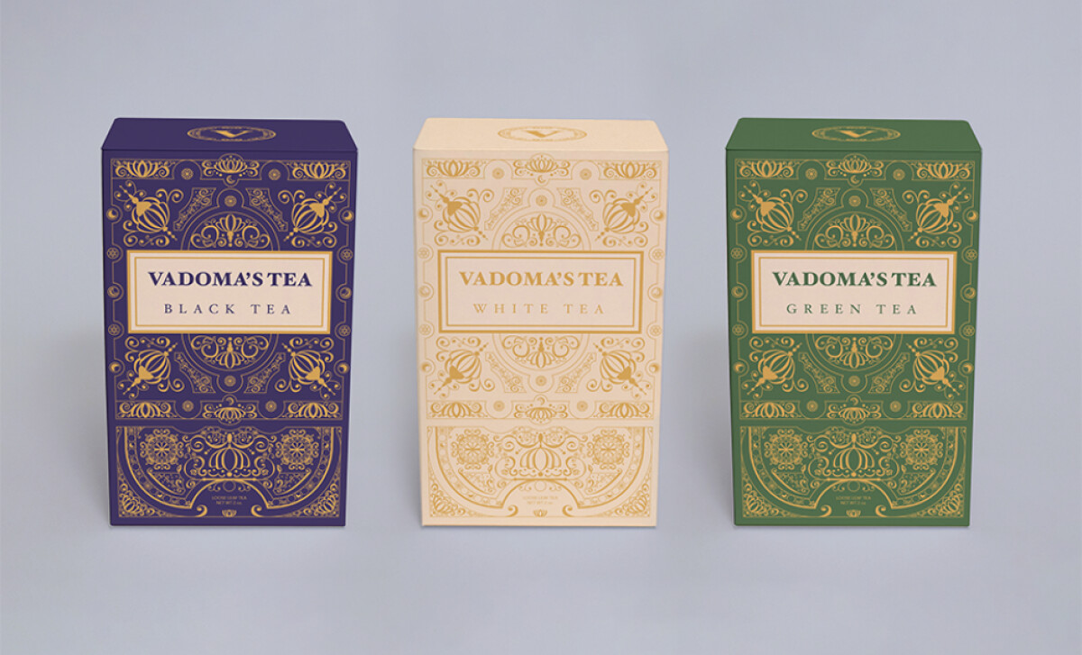
A gemstone-inspired color palette is used to differentiate the various tea blends. Each variety gets its own rich, jewel-like color, such as a milky quarts for white tea or amethyst purple for black tea.
This serves two purposes. It adds to the brand's luxurious and mystical theme, and it also makes it very easy for customers to tell the different tea varieties apart.
This dual-purpose approach is what separates good packaging from the best tea packaging designs.
81% of consumers have tried something new because the product packaging caught their eye, and the jewel tones here are nothing but very eye-catching, whether you see them in a store or online.
They create a strong brand presence that is both varied and instantly recognizable as belonging to Vadoma's Tea.
The Framed Serif Wordmark Anchors the Brand in Elegance
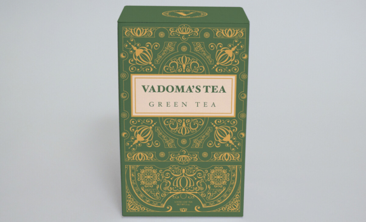
Centered on the front panel, the "VADOMA'S TEA" logotype appears in a classic serif typeface. It's all-caps, letterspaced, and set inside a thin rectangular frame.
The flavor descriptor is in a slightly smaller font below. The wordmark adopts the color of the packaging background, which helps enhance readability.
The choice of a classic serif font is a perfect match for the brand's mystical and historical theme. Plus, the rectangular frame around the name helps to ground the design. It creates a calm, organized space in the middle of the very detailed pattern.
This design choice is both beautiful and practical. The simple typography gives your eyes a break from the detailed pattern.
It also makes sure that you can easily read the brand name and the flavor of the tea, which is the most important job of the label.
Unified System with Thematic Consistency Across Variants
There is a strong sense of unity across the different tea varieties. Every box uses the same symmetrical foil pattern and the same typographic layout.
This is a great way to keep the brand’s story of ritual consistent and to get customers interested in the entire product line.
Not to mention, this consistency boosts brand trust and strengthens recognition, especially when the products are displayed side-by-side.
This system is also practical, as it enables easy expansion for future SKUs. New flavors can be added without requiring a complete reinvention of the core aesthetic.
It’s the kind of strategic foresight you see from outstanding packaging design agencies.
This packaging is a brilliant example of how a strong story can create a standout product. Christopher Klaich’s design feels like a rare find and transforms a simple cup of tea into a sacred ritual.
What Agencies Can Learn from Vadoma's Tea
Christopher Klaich’s design for Vadoma's Tea is a powerful example of how narrative-driven packaging can create a distinct and memorable market presence.
Here’s what creative teams can take away:
- Color is a strategic asset. Eye-catching design is proven to drive trial, as 81% of consumers have tried a new product simply because its packaging caught their eye. A thematic color system can both attract attention and tell a story.
- Typography creates clarity. While ornate visuals attract the eye, simple and unique typography is what contributes to brand recognition, ensuring the design is not just beautiful but memorable and readable.
- Consistency is a financial strategy. A unified design system is a direct contributor to the bottom line, as companies report that consistent branding can contribute to revenue growth of 10-20%.
Ultimately, the design succeeds because it sells an experience, turning the simple act of making tea into a moment of ritual and magic.
You can make your product feel like a special keepsake by creating packaging with beautiful, intricate details that customers will want to hold onto.
That's why brands turn to expert partners, and our team has ranked the best agencies worldwide to make finding them simple.
Visit our Agency Directory for the Top Packaging Design Companies, as well as:
Our design experts also recognize the most innovative design projects across the globe. Visit our Awards section to see the best & latest in packaging design.
-preview.jpg)