Impactful creations exude design balance, demonstrating stability and visual cohesion. As foundational design approaches, Symmetry and Asymmetry define how this balance is achieved. Symmetry emphasizes harmony through repetition and mirrored elements, creating order and consistency, while Asymmetry uses contrast and varied visual weights to produce dynamic and engaging compositions.
The key challenge for designers is determining when to employ symmetry or asymmetry effectively. And the solution lies in understanding their unique characteristics, benefits, and applications in alignment with the design’s purpose, audience, and medium.
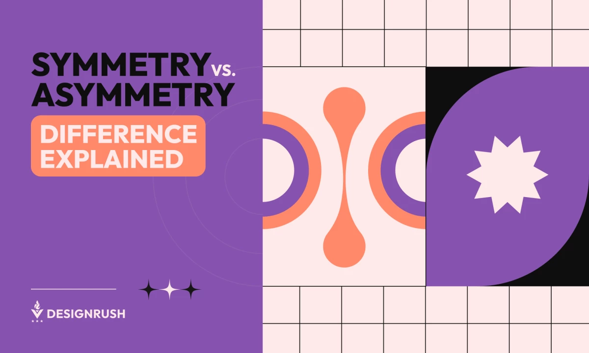
Difference Between Symmetrical and Asymmetrical

Symmetry, one of the basic elements of graphic design, is the visual alignment of elements around an axis or central point, creating balance through repetition and mirroring. Common examples include symmetrical logos like Target's concentric circles. It conveys clarity and harmony, making designs feel familiar and stable.
Asymmetry, on the other hand, achieves balance by distributing visual weight unevenly yet purposefully. Examples include dynamic layouts in avant-garde magazine spread or asymmetrical grid designs in modern web interfaces. This approach fosters movement and curiosity, guiding the viewer's attention across the design.
The interplay of symmetry and asymmetry creates visual balance by addressing predictability or dynamic tension, depending on the design’s intent.
Benefits of Symmetry vs. Asymmetry in Designs
Balance in design extends beyond aesthetics; it influences how users perceive and interact with content. Symmetry and asymmetry serve unique roles in achieving this balance. While symmetry offers order and predictability, asymmetry provides creativity and intrigue, allowing designers to cater to diverse goals and audiences.
Benefits of Symmetry
- Creates Harmony, Order, and Familiarity
Symmetry fosters balance and cohesion, making designs look streamlined and well-organized. This approach aligns with essential principles of web design and can be especially beneficial in structured layouts like eCommerce websites. - Conveys Stability, Consistency, and Professionalism
Uniformity in symmetrical designs communicates reliability and professionalism, which is often helpful in corporate logos and annual reports, where trust and authority are essential. - Eases User Navigation by Creating Predictable Layouts
Symmetrical designs guide users through content effortlessly, reducing cognitive load and enhancing usability. - Offers a Timeless Aesthetic
Symmetry's universal appeal ensures its relevance across time, making it ideal for classic and formal design applications. - Builds Trust and Reliability in Branding
Consistent, symmetrical elements evoke a sense of dependability, helping brands establish strong, trustworthy identities.
Benefits of Asymmetry
- Adds Visual Dynamism, Energy, and Creativity
Asymmetry introduces movement and excitement, making designs visually compelling and engaging. - Draws Attention to Specific Elements
The strategic imbalance creates focal points, directing users to key content such as calls-to-action or highlighted products. - Encourages User Engagement Through Curiosity and Exploration
Asymmetric layouts invite viewers to explore, perfect for modern and narrative-driven projects. - Facilitates Storytelling by Guiding the Viewer’s Journey
It allows designers to lead the audience through a visual story, creating an immersive experience. - Allows for Flexibility and Innovation
Asymmetry supports experimental and abstract designs, offering creative freedom beyond rigid structures.
When to Choose Symmetry or Asymmetry
| Symmetry | Asymmetry | |
| Purpose | Structured, formal content | Creative or narrative-driven projects |
| Audience | Traditional, order-seeking users | Modern, experimental users |
| Emotion | Stability, trust, reliability | Excitement, playfulness, spontaneity |
| Cultural Context | Associated with perfection and balance | Linked to uniqueness and creativity |
| Brand Identity | Consistency and tradition | Innovation and originality |
| Platform/Medium | Print, grid-based layouts | Digital interfaces, abstract designs |
Choosing between symmetry and asymmetry depends on multiple factors, from design purpose to cultural context. A thoughtful evaluation of these factors ensures the approach aligns with the project’s goals and audience expectations.
- Purpose of the design: Symmetry is ideal for structured, formal content such as corporate materials, academic publications, or financial reports. On the other hand, Asymmetry excels in creative projects, such as branding for innovative startups or artistic storytelling.
- Platform and medium: Symmetry suits print media and grid-based layouts, while asymmetry works best in dynamic digital interfaces and artistic applications.
- Cultural and contextual factors: Consider cultural associations — some cultures value symmetry as a sign of perfection, while others celebrate asymmetry for its uniqueness and imperfection.
- Audience expectations: Traditional audiences appreciate symmetry for its predictability and order, while asymmetry appeals to modern, experimental users seeking dynamic visuals.
- Brand identity: Brands emphasizing consistency and tradition benefit from symmetry, while those prioritizing innovation and originality thrive with asymmetry.
- Message or emotion: Use symmetry to communicate stability, trust, and reliability. Conversely, asymmetry evokes excitement, spontaneity, and creativity.
How to Use Symmetry and Asymmetry in Design
Symmetry and asymmetry are design principles and tools for shaping user experiences. To maximize their potential, designers must consider their application beyond mere aesthetics, aligning with the content's goals and the audience's needs.
Techniques for Symmetry
Grid Systems and Layouts
Leverage grid systems to create consistent alignment and structure across designs. For example, websites often employ grids to organize content, ensuring that text blocks, images, and CTAs are evenly spaced for readability and a clean layout. This approach is particularly effective for designs that prioritize clarity and uniformity, such as portfolios or business reports.
Consistent Use of Shapes and Sizes
Repeating uniform shapes, such as circles, squares, or rectangles, reinforces a sense of order. For instance, product packaging often employs identical geometric elements to create a cohesive and professional appearance. This technique is excellent for building visual unity and reducing complexity.
Alignment and Distribution of Elements
Properly aligning elements along a central axis or margins establishes harmony and focus. For example, aligning the header, body text, and decorative elements in a formal invitation creates a polished look. Ensuring even distribution avoids overcrowding and enhances readability.
Implementation of Different Symmetry Types
Employ various symmetry types to achieve balance and meet different design objectives:
- Reflectional Symmetry: Mirror elements across an axis for a balanced look, commonly used in logos and branding. For example, the Mastercard logo features two identical circles on either side of the axis, conveying reliability.
- Translational Symmetry: Repeat elements horizontally or vertically to create patterns, ideal for wallpapers, product packaging, or website backgrounds.
- Radial Symmetry: Arrange elements around a central point to convey motion and energy, frequently seen in icons, badges, or dynamic visuals.
- Bilateral Symmetry: Divide a design into two equal halves for formal layouts, such as invitations or educational materials, ensuring balance and accessibility.
Techniques for Asymmetry
Rule of Thirds
Implement the Rule of Thirds by dividing the canvas into a 3x3 grid and placing key elements along the intersections to create an off-center focus. For example, in web design, placing a subject or CTA button at these points draws attention naturally while maintaining visual interest.
Layering and Hierarchy
Organize components utilizing layers and set up a clear visual hierarchy. For example, stack elements in a layered fashion, with the most important appearing more prominently, such as a bold headline overlaying a muted background.
Dynamic Scaling
Use varying sizes to guide focus. For example, a large hero image combined with smaller text sections on a homepage directs attention first to the image and then to supporting information, creating a dynamic and engaging layout.
Negative Space
Balance heavier elements with ample negative space to create a clean, modern look. For example, minimalist website designs often feature asymmetrical layouts with plenty of white space, allowing the content to breathe while drawing focus to key elements.
Unbalanced Yet Purposeful Placement
Position elements in unexpected ways while maintaining functional coherence. For example, a magazine cover might place a headline off-center, balanced by a bold image or contrasting typography, to create a sense of movement and intrigue.
Symmetry vs Asymmetry: Common Mistakes to Avoid
Achieving balance through symmetry and asymmetry requires careful consideration of design principles and their execution. Missteps can result in visuals that fail to resonate with the audience, diminish usability, or compromise the intended message. Below, we delve into common mistakes and how to avoid them.
- Overemphasizing Balance in Symmetry: In striving for perfection, some designers create overly mechanical layouts that lack personality or character. Introducing subtle, organic variations can make symmetrical designs feel more human and relatable.
- Overcomplicating Asymmetrical Designs: Using too many contrasting elements, colors, or textures can confuse viewers. Instead, focus on a few key contrasts and use negative space to provide balance and breathing room.
- Neglecting Accessibility: Complex asymmetrical layouts or overly balanced symmetrical designs may fail to meet accessibility standards. For example, insufficient contrast between elements or a lack of intuitive navigation can alienate users.
- Ignoring Context: Applying symmetry or asymmetry without considering cultural and project-specific factors can result in mismatched visuals.
- Overlooking Visual Hierarchy: In symmetrical designs, failing to emphasize key elements might make everything blend. On the other hand, in asymmetrical designs, neglecting hierarchy can lead to chaotic layouts.
- Forgetting Scalability and Adaptability: Designs, especially digital ones, must adapt to various screen sizes and resolutions. Symmetrical designs might look too rigid on smaller screens, while asymmetrical website layouts may lose balance when resized.
Examples of Symmetrical Designs
Having considered the nuances of symmetry in design, let's delve into some illustrative examples. The following cases highlight how symmetry manifests across different mediums and contexts.
Mercedes Benz Logo: Timeless Brand Identity Through Perfectly Balanced Symmetry
The Mercedes-Benz logo epitomizes precision and elegance through its flawlessly symmetrical design. The iconic three-pointed star, encased in a perfect circle, reflects a harmonious balance, symbolizing the brand’s commitment to excellence across land, sea, and air. The geometric symmetry enhances its timeless aesthetic, ensuring immediate recognition and universal appeal.
New Yorker Website: Balanced Symmetry Elevates a Legacy in Digital Journalism

The New Yorker website's design is defined by its meticulous symmetry, where content grids, typography, and imagery align to create a cohesive and polished user experience. The balanced structure reflects the magazine's long-standing commitment to clarity and sophistication, guiding readers effortlessly through its diverse content. The website honors its print heritage by maintaining such precise alignment while delivering a modern, engaging digital interface.
Examples of Asymmetrical Designs
Now, let's explore designs that thrive on imbalance to create visual intrigue. These examples demonstrate how asymmetry can add dynamism and depth across various creative contexts.
Umberto Eco Book Cover: Bold Asymmetry That Evokes Intrigue and Dynamism

The Umberto Eco book cover design stands out with its striking asymmetry. The cleverly positioned cutouts on the dust jacket break away from traditional design balance. The swirling patterns and fragmented elements create a sense of dynamic movement, sparking curiosity without revealing too much. By embracing asymmetry, the design draws attention and elevates the book into an art piece.
Kahut Packaging: Asymmetry as a Tool That Reflects Cultural Fusion

Kahut's packaging design captures the spirit of cultural fusion through its bold use of asymmetry, creating a dynamic and engaging visual experience. The irregular lines and geometric cutouts subtly disrupt the traditional balance, symbolizing the vibrant intersection of cultures and the brand’s celebration of diversity. The asymmetry in the design brings energy and life to the packaging, making it a distinctive representation of the brand’s commitment to embracing variety and individuality.
Symmetry vs. Asymmetry: The Bottom Line
Symmetry and asymmetry remain pivotal in crafting engaging designs. By leveraging their unique strengths, designers can evoke specific emotions and capture attention. Experimenting with both approaches fosters creativity while ensuring thoughtful balance captivates audiences. Embrace the interplay of symmetry and asymmetry to make impactful designs in today’s ever-evolving creative landscape.
Symmetry vs. Asymmetry FAQs
1. Can symmetry and asymmetry be combined in one design?
Yes, combining symmetry and asymmetry can create a visually dynamic design that blends stability with creativity. Symmetry can provide a sense of order, while asymmetry adds excitement and movement. This combination keeps the design interesting and balanced without sacrificing structure.
2. Which is better for user interfaces: symmetry or asymmetry?
Symmetry is often preferred in user interfaces for its clarity and predictable structure, which makes navigation intuitive for users. It's especially useful for interfaces where ease of use and consistency are key. However, depending on the project's goals, asymmetry can be effective for adding engagement and creating a unique, dynamic experience.
3. Is asymmetry more complicated to use?
Yes, asymmetry requires a more nuanced approach to balance, visual hierarchy, and spacing. Improper use can lead to disorganization and a sense of imbalance, making the design feel chaotic. However, when executed well, asymmetrical designs can create visual interest and a sense of movement that symmetry might lack.