- Article by
- Branko Dimitrijević

#46B15A #E11987 #CC3527 #B7A120
- Designer: Joshwa Henderson
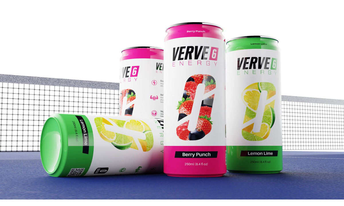
- Client: Verve 6 Energy
- Category: Packaging Design – Food & Beverage
- Location: Orlando, Florida, United States
- Project Brief: Create vibrant, approachable packaging for a new energy drink brand designed for everyday athletes, emphasizing bold flavor, lower caffeine content, and a playful alternative to traditional performance-driven energy drinks
Energy drink packaging often relies on extreme performance cues or aggressive aesthetics to signal intensity.
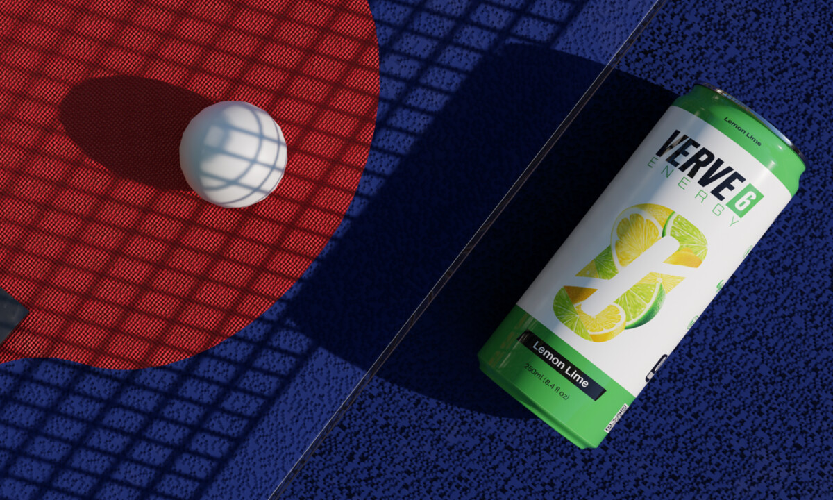
Verve 6 Energy takes a different approach, using color, scale, and clarity to communicate energy that feels accessible, playful, and rooted in everyday activity rather than elite athletics.
- Brand Expression & Positioning: The visual identity positions Verve 6 as energetic without feeling intimidating or over-engineered. I like how the design supports casual movement and social play, aligning the brand with accessible activities instead of high-adrenaline extremes.
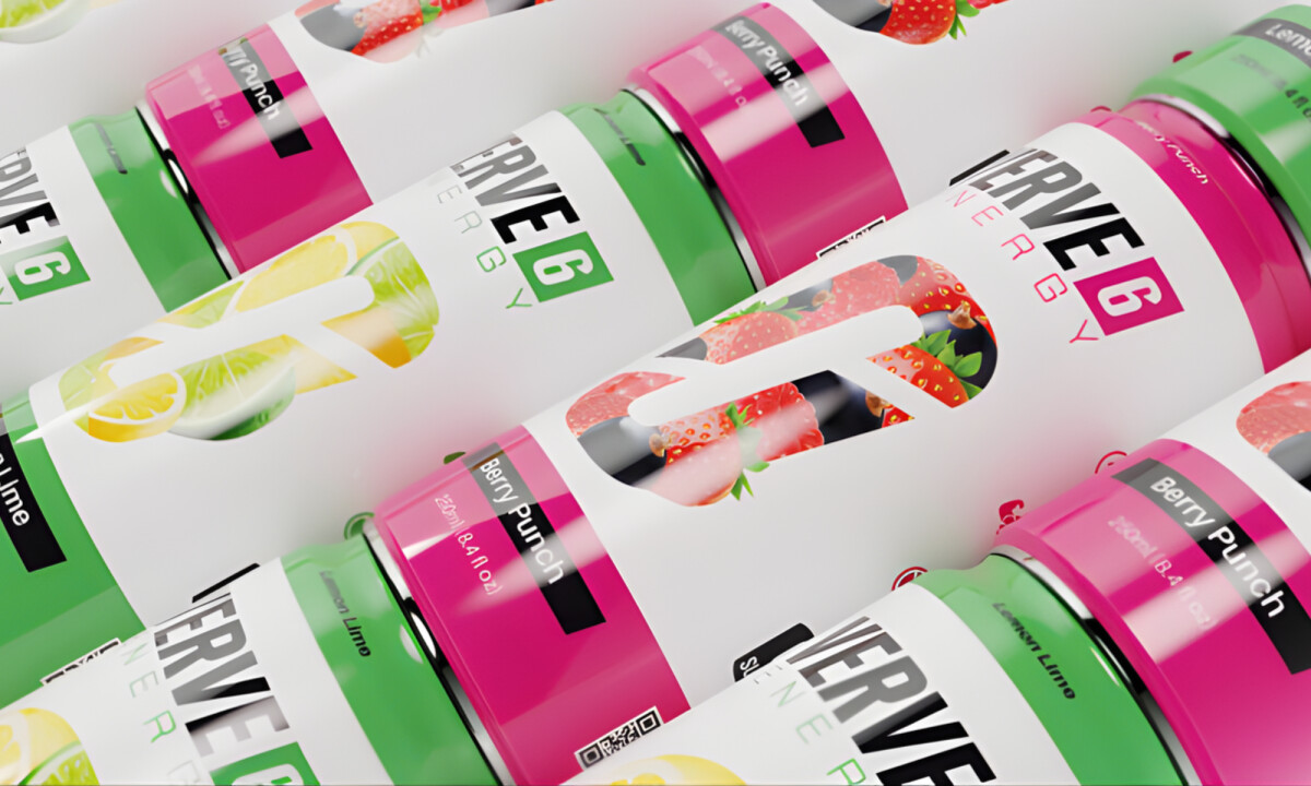
- Color System & Flavor Communication: Bold, saturated colors clearly distinguish flavors while maintaining consistency across the lineup. The oversized fruit imagery effectively signals taste-first appeal, allowing flavor to lead rather than functional claims.
- Typography & Logo Integration: The logo is treated as a strong, modular element that anchors the layout without overpowering the can. I believe the balance between bold typography and negative space keeps the packaging readable at a distance and on the shelf.
- Layout & Packaging Structure: The vertical can format uses a clear hierarchy to separate brand, flavor, and product information. I appreciate how the layout feels adaptable, making the system scalable for future flavors without losing visual coherence.
What Brands & Designers Can Learn from Verve 6 Energy
1. Reframe Energy Around Everyday Movement
Positioning the brand around play and casual activity makes energy feel approachable rather than intimidating. Expanding beyond elite athletic cues opens the product to a wider audience.
2. Let Color and Flavor Lead the Message
Bold palettes and oversized fruit imagery make taste the primary signal at shelf level. Clear flavor communication builds immediate appeal without overloading functional claims.
3. Build a Scalable Layout System
Strong logo placement and clear hierarchy allow new flavors to be added seamlessly. Flexible structure ensures consistency as the product line grows.
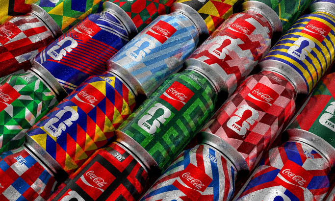
Coca-Cola FIFA World Cup 26 Collectible Country Cans
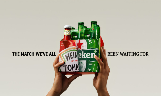
HEINZ x Heineken® Limited Edition Six-Pack
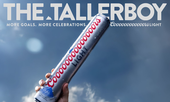
Coors Light Tallerboy
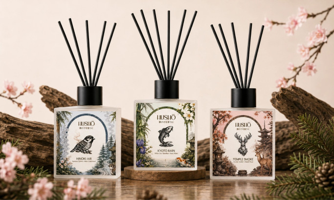
Hushō

Mật Mã Gift Set

I AM ITALIANO