Standout Features:
- Bold, high-impact color scheme
- Strong, culturally inspired branding
- Clear and engaging product communication
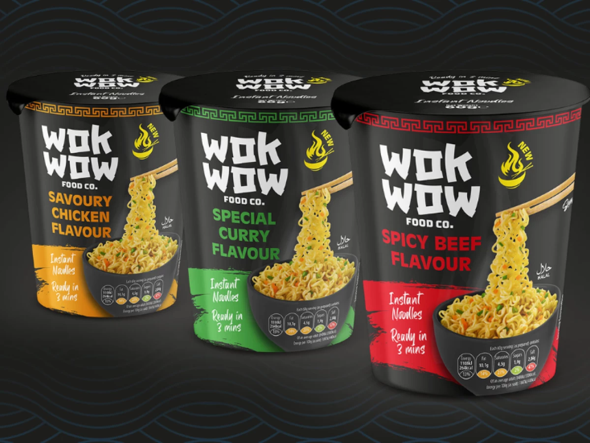
Wok Wow, an instant noodle brand by DMB Foods, needed packaging that stood out on shelves while capturing the essence of its cuisine. Scene Print & Design delivered a striking visual identity that fuses bold colors, cultural elements, and clear messaging, successfully balancing aesthetic appeal with strong branding.
The black background creates a premium feel, while red, orange, and green accents differentiate flavors and add vibrancy. This contrast not only enhances shelf presence but also reinforces the spicy, savory flavors associated with Asian cuisine. The color choices ensure the packaging remains eye-catching and easily distinguishable from competitors.

A key branding element is its strong cultural inspiration. The logo features an edgy, brushstroke-style font reminiscent of traditional Chinese calligraphy, while a flame icon adds an energetic touch. Decorative borders inspired by Asian motifs further tie the design to its roots. These elements create a cohesive identity that connects with consumers.

Beyond aesthetics, the packaging excels in clear and engaging product communication. Prominent flavor labels, preparation time, and nutritional icons ensure customers quickly grasp key information. The chopsticks lifting noodles add a dynamic visual cue, reinforcing the instant, convenient nature of the product.
With its visually striking presence, cultural authenticity, and effective messaging, Wok Wow’s packaging sets a high standard for food packaging design. Scene Print & Design has crafted a design that not only catches the eye but also builds a strong, memorable brand identity, making Wok Wow a standout choice in the instant noodle market.

_f6693419208d-preview.jpg)