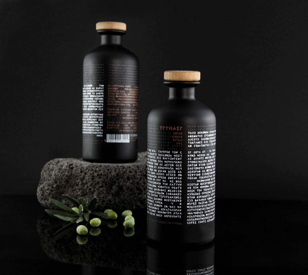
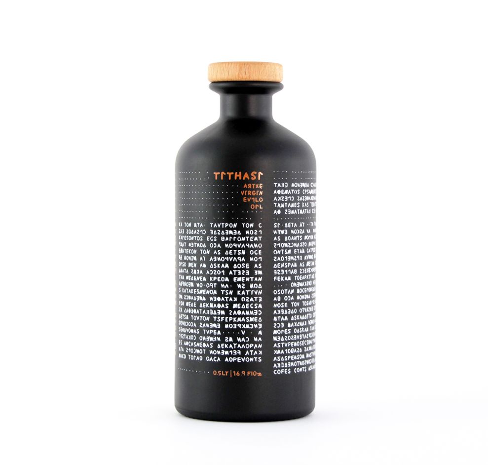
Don’t strain to read the text on this bottle of olive oil too hard. That is, unless you can read ancient Greek scripture. The attention to detail in Tithasi’s Olive Oil design is incredible. Designers have taken the lore of ancient Greece that inspired the name of the brand and turned that scripture into the focal point. Everything about this brand is consistent—inside the bottle and out.

Tithasi is the olive tree tamed in Ancient Greece. This Greek olive oil container design embraces the rich history of Ancient Greece and the luxury flavor of the product inside. The layout is simple, clean, elegant, and rustic—all at the same time. The typeface mimics an ancient text because the words written on the bottle are literally a piece of ancient Greek scripture. Looking at this container feels like looking at a piece of history.

The dark, matte coloring of the bottle almost makes it appear as if the bottle is crafted from clay or stone—like an ancient pot you would see in a museum. Before even tasting the olive oil, you will feel like you are about to experience something authentic. The bottle design has already set the tone for the product itself.

Tithasi’s container design almost makes it unfair to compare them to any other brand of olive oil, at least visually. The bottle prepares you for a taste of ancient Greece. You’re not just about to taste great olive oil; you’re about to experience a piece of history.
Tithasi Olive Oil is a great packaging design in the Food & Beverage industry.


