Standout features:
- A design that embraces international varieties
- A unique font throughout
- Palette focusing on two colors only
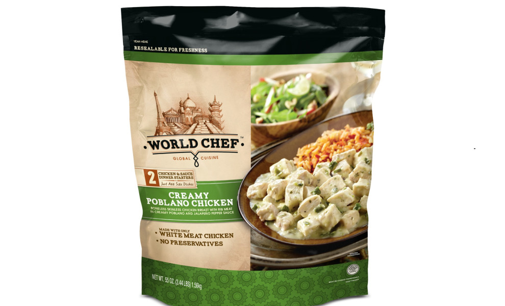
World Chef is a food and beverage brand whose branding and packaging design is the work of PKG agency. The end goal was to "capture a growing consumer desire for new international and ethnic flavors." The resulting packaging conveys World Chef's devotion to respecting the authenticity of international cuisine.
To depict this encounter with different cultures and encourage consumers to indulge in them, the agency created a design that relies on famous landmarks of different nations. A different package was designed for each new food pairing, as the "brand’s engraved iconography and shopworn feel allows the bright, colorful ingredients to pop" in order to highlight the quality of the ingredients.
A delightfully delicious image of a dish is featured prominently on the front of the bag, with a single serif font of varying sizes communicating the dish's name, ingredients, and other consumer info of note.
More succulent imagery and in-depth content that elaborates the messaging on the front are found on the back of the packaging. A shade of beige is the primary color for the bag, with accents — depending on the type of food inside — coming in various colors.
The Thanksgiving edition of the packaging uses a unique and interesting take on an illustration of a Turkey with colorful lines in the background, limiting the palette to brown, blue, yellow, and green.


